


Openers and closers
Brand redesign and website for a company specialized in electronic locks
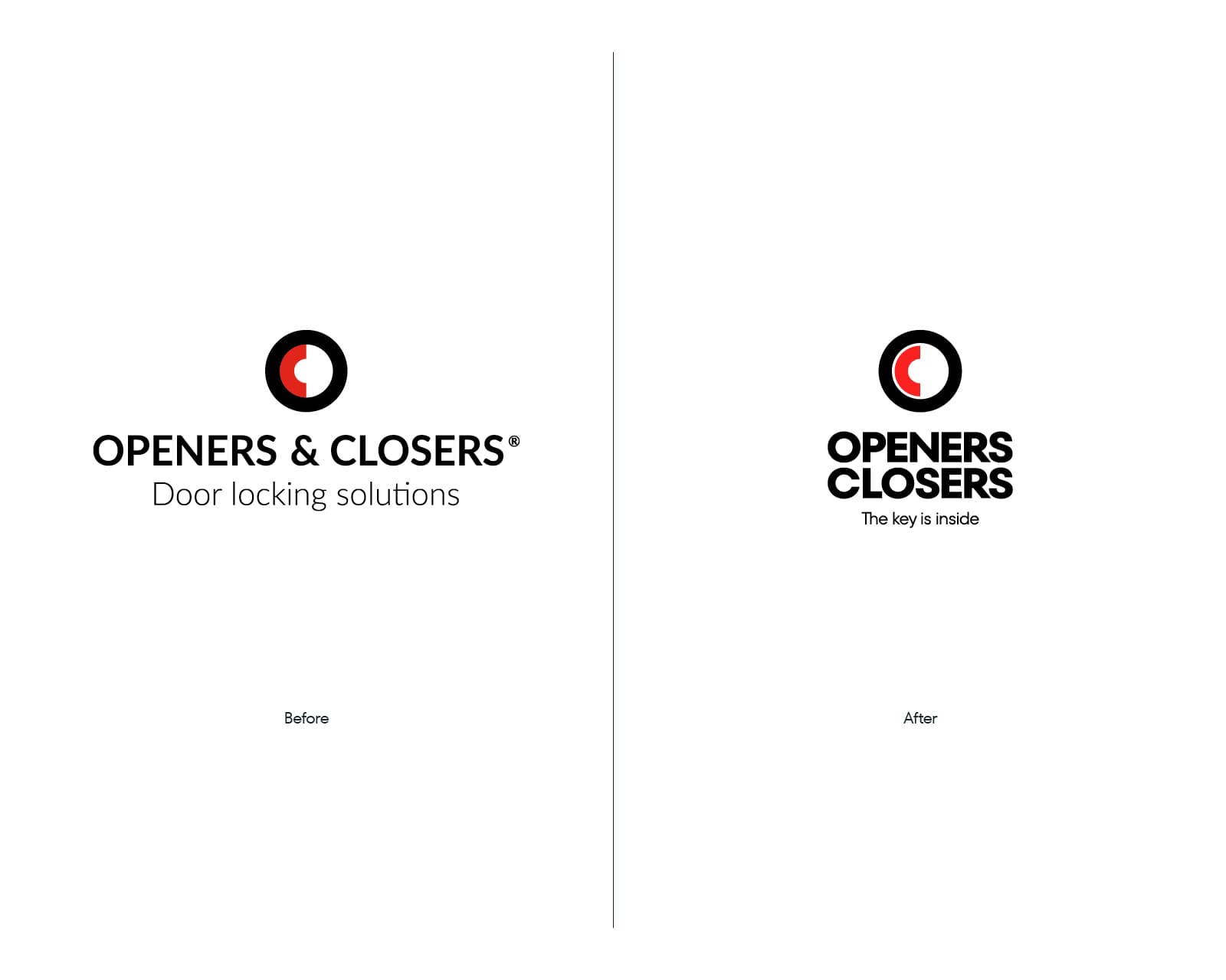
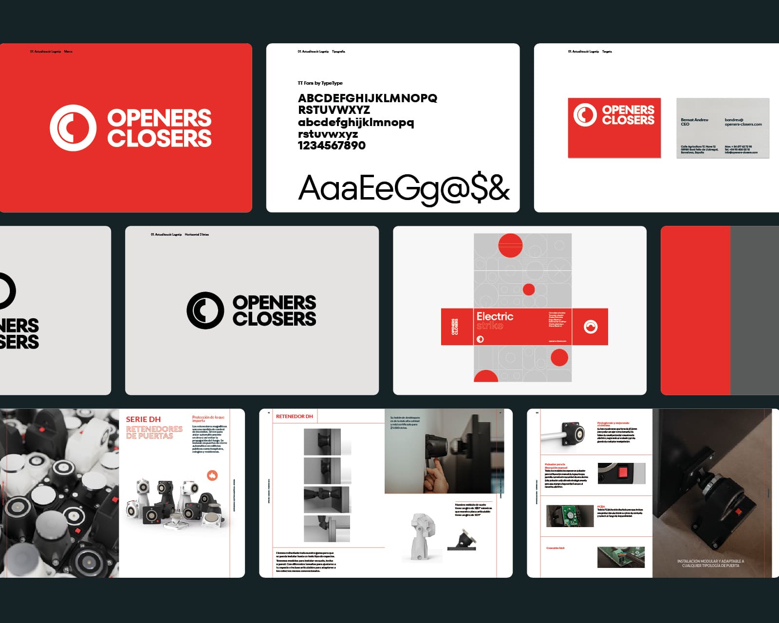
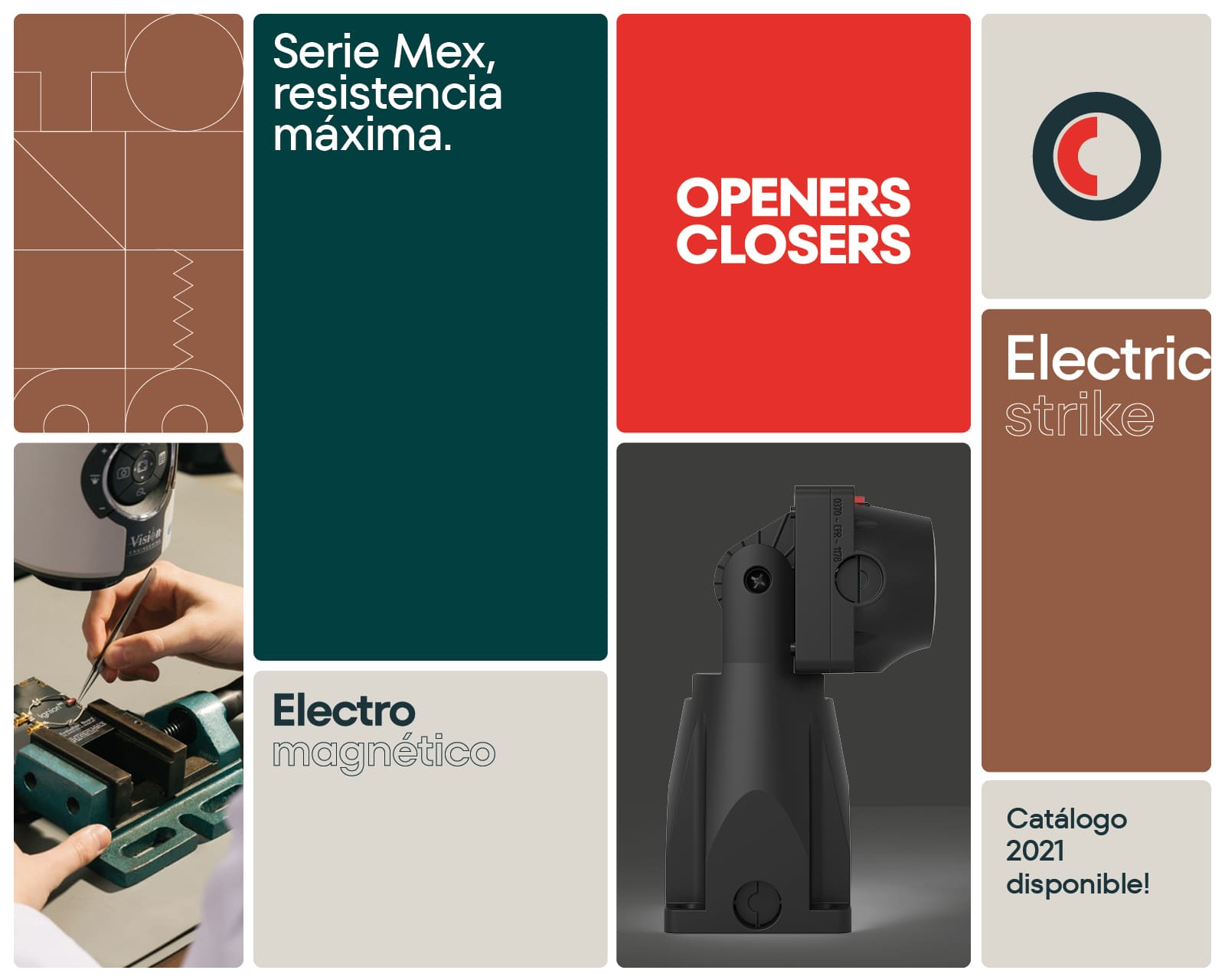
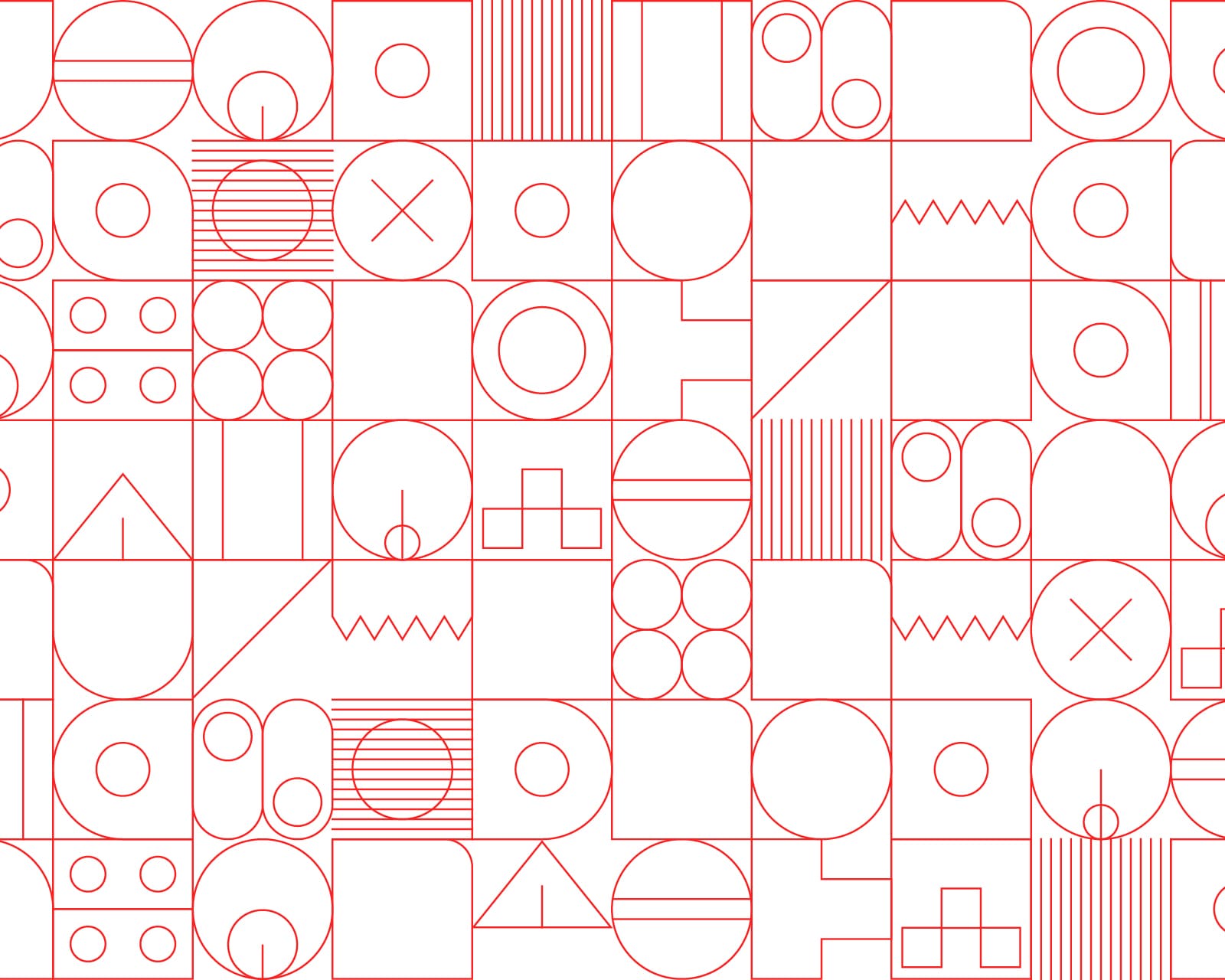
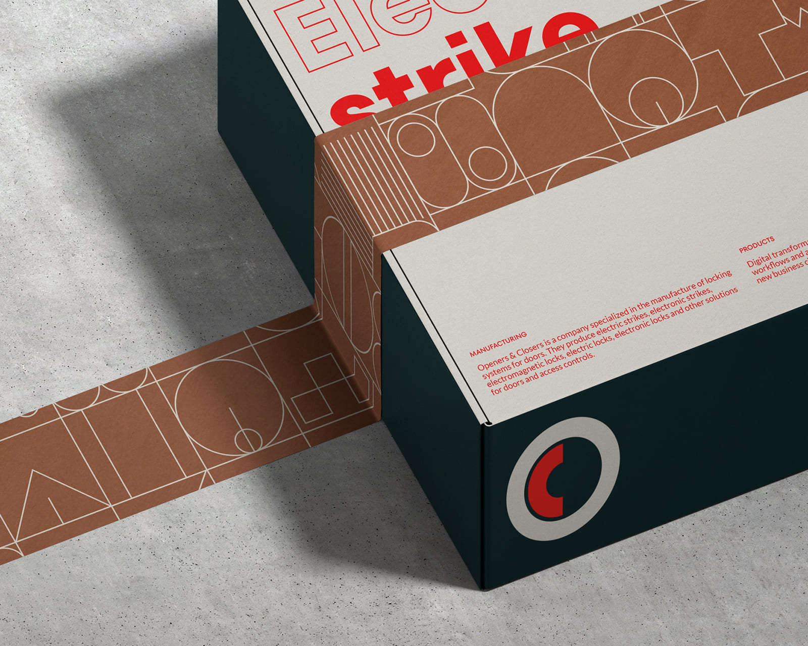
The project for this company specialized in electronic technology for doors and locks begins with a brand study with the objective of updating its identity through a new geometrization of the symbol and a new typographic exercise. The project continues with the proposal of a new graphic code, several communication elements and the creation of a new website.
The great challenge for the new site lies in the study and organization of its complex product catalog with the aim of synthesizing and ordering all product ranges and families through an interactive and functional experience, focused on the creation of leads as well.
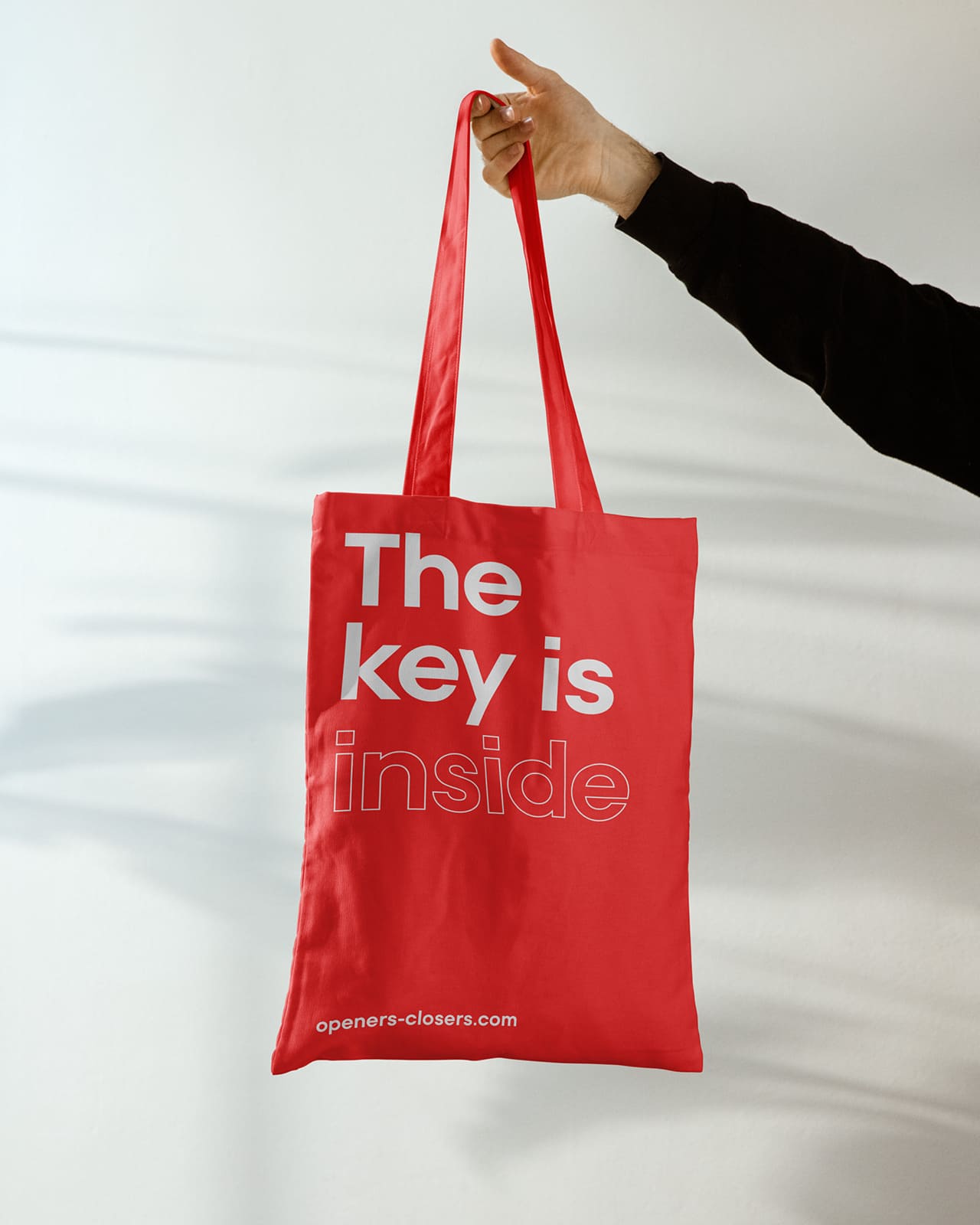
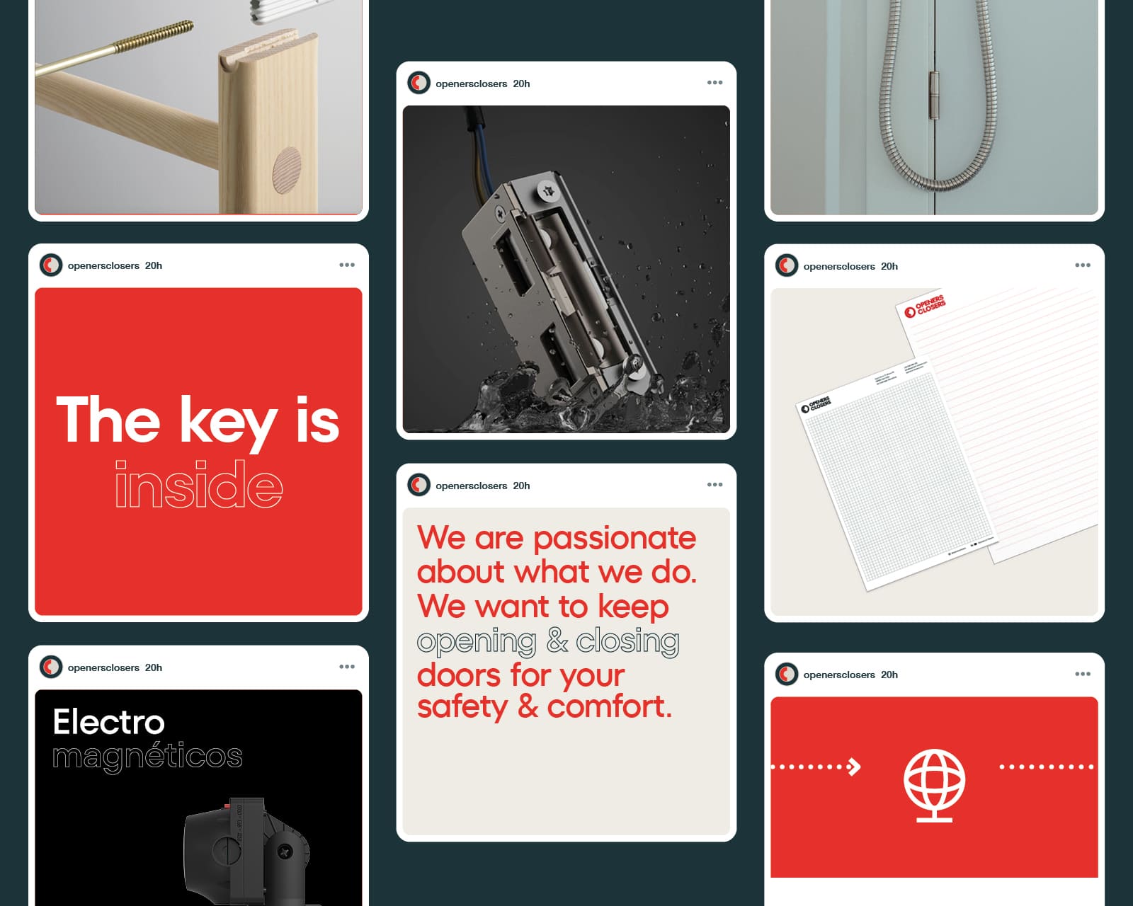
The new brand claim, “The key is inside”, emphasizes the importance of the technology inside the different parts of an electric lock and at the same time is a play on words in reference to the key that opens them. To help to visually understand all this technical complexity, the different elements that make up each piece and that cannot be seen with the naked eye are recreated in 3D animated format and are assembled/disassembled interactively.
These animations together with an orderly, interactive and well classified design make up the new virtual catalog of the brand as well as help to understand its inner workings, its features and other details of the products. Also information about the company, its innovation and manufacturing processes.