

Centre de Cultura Contemporània de Barcelona (CCCB)
Interior graphic design for the largest exhibition of photobooks held in Europe
An exhibition divided into 8 chapters (each one curated by a prestigious curator) and two venues, the CCCB and the new headquarters of the Fundació Colectania for the promotion of photography.
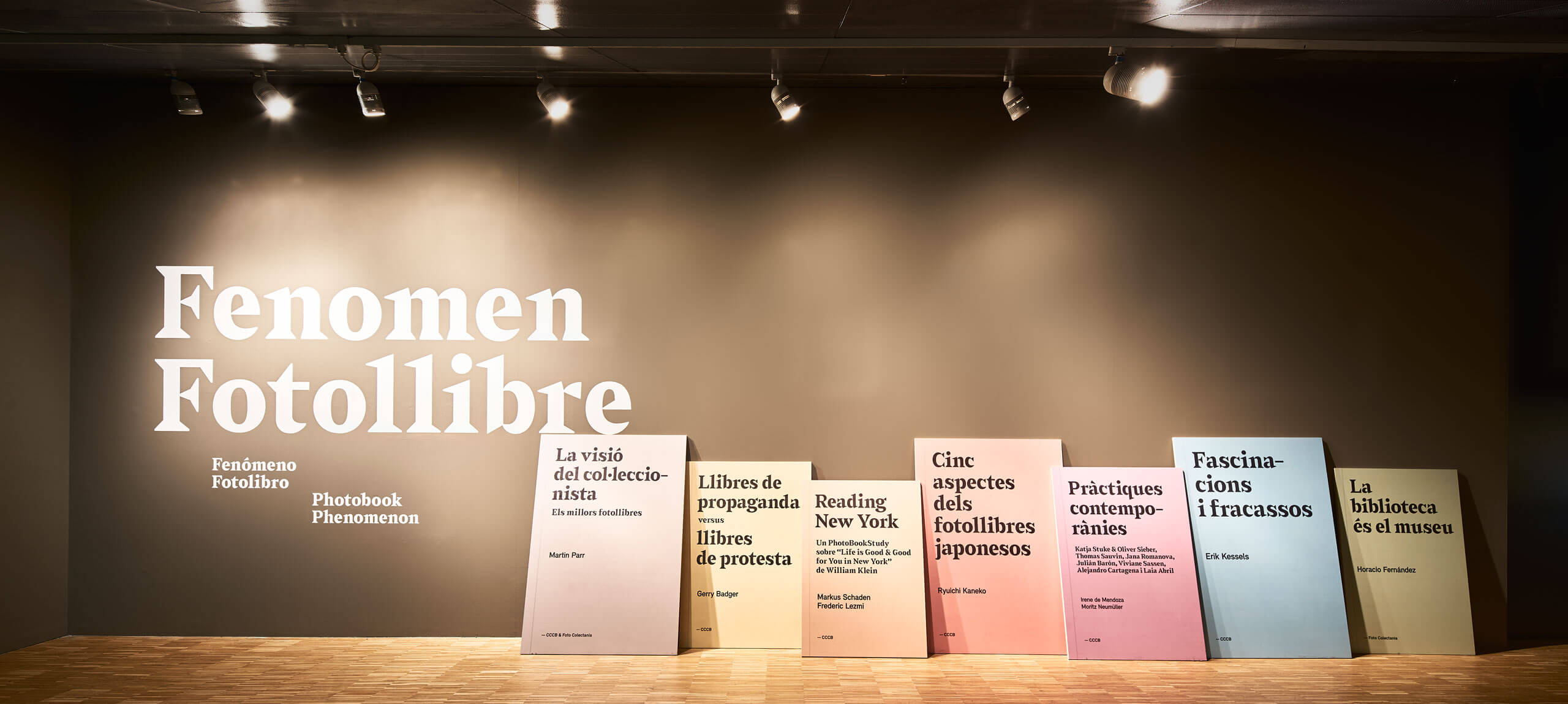
We designed the graphic identity based on the editorial design of the books to explain, refer and contextualize the visitor in the world of books. Through the use of typefaces and compositional boxes, the covers and the editorial structures, we created a book collection environment that helped us to organize navigation within the exhibition.
Challenge
The client and the curator’s team designed the exhibition giving the maximum expression to the object: the photobook, with which we had to create subtle graphics that help with the navigation in the exhibition and, at the same time, structure its different chapters co-curated by Martin Parr, Gerry Badger, Markus Schaden & Frederic Lezmi, Ryuichi Kaneko, Erik Kessels, Horacio Fernández, Irene de Mendoza and Moritz Neumüller. We had to create austere graphics but, in turn, with enough character to stand out in the environment.
Process
For the entrance we worked on volumetric totems that symbolized the book covers (each section of the exhibition) that made up the collection.
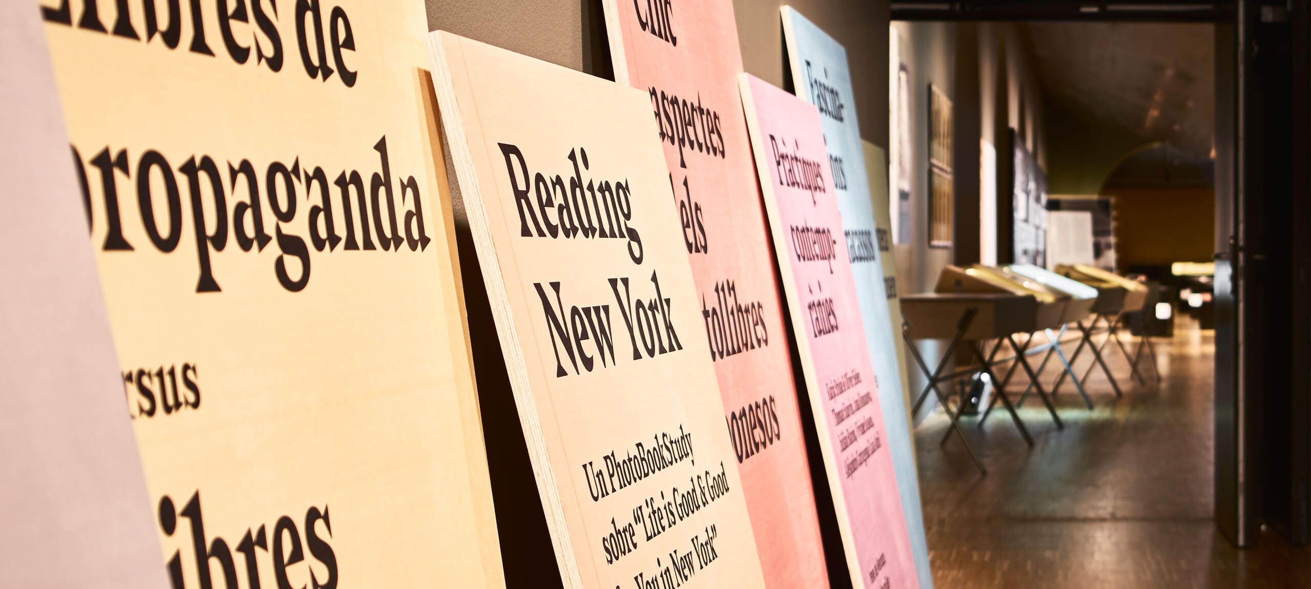
For the production of the signage elements and the texts of the exhibition we worked side by side with the production department of the CCCB and Manual Color, researching organic systems and media to achieve the most editorial result possible without falling into the classic materials of a typical exhibition production. The elements of the exhibition are pages of books which are oversized and glued to the walls of the space, taking the editorial design to the graphics.
The headings and the contextualization texts of the exhibition were designed as if they were introductions to a photobook, and then produced on the roughest paper possible with which, on shining the light, we will travel to the feeling we have when we look through a book. We wanted the books to be the axis of the whole exhibition, from the content to the graphic design itself.
Conclusion
An exhibition design structured from the content itself, seeking to weave a complicity between the architecture, the exhibition design, the curatorial discourse and the very nature of the exhibition. Eminently a work of hierarchy and identity construction through typography and editorial design.
+Info exhibition » Fenomen Fotollibre
Exhibition design » Queralt Suau Studio
Curating » Moritz Neumüller


