

Xócala
Naming, identity and product design for a social economy chocolatier business
Josep Teixidó, the main driver behind the workshop and the business project, contacted Toormix to define the values and attributes of the brand, the creation of its name, design of the identity and definition of the visual code, as well as the development of the line of packs offered. Additionally, the consultancy has been commissioned for the design and conceptualization of new product lines.
The challenge of the project has been to find the combination between the conceptualization of the brand, the values and the team via a fresh and contemporary image. The objective is not to articulate the discourse from the inclusive nature of the project, but rather emphasize the creativity and the quality of the product. The philosophy of Xócala lies in the basis of high quality chocolate with social awareness, with the latter functioning as just another characteristic, thus the decision was reached that social awareness shouldn´t lead the main commercial strategy of the brand.
For the design of the naming and the subsequent creation of the graphic brand, we worked with the idea of “high-fiving” as a synonym of carrying out good teamwork. A greeting in the form of a joining of hands that simultaneously communicates a joint effort and manual work, characteristic of pastry craftsmanship. The “xócala” as a result of the feeling of working in a group, the culmination of a project and at the same time of the union and inclusion that brings together several profiles that are welcomed through this greeting.
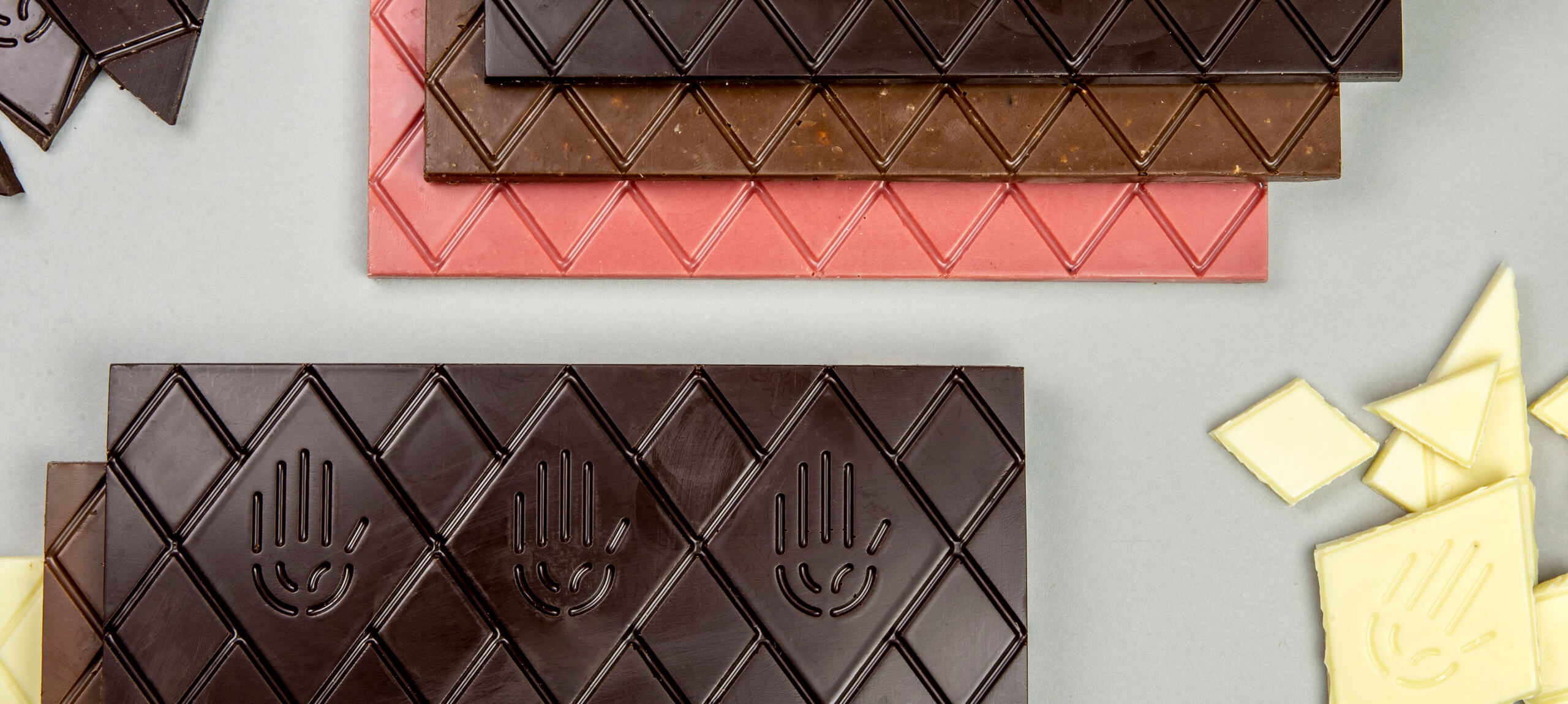
For the formalization of the identity, we worked with the symbol of a hand, which is repeated throughout the packs in the form of Indiana to generate the idea of variety and team, as well as expressing movement that plays with directions and combinations which cross and interlace with eachother. The range of colors that distinguishes itself through the different types of chocolate is vibrant and helps convey a cheerful character and one bursting with energy.
“Històries de xocolata” (Histories of chocolate) is the slogan defined for the brand, which expresses the idea that behind each product and each idea lies a different story, fruit of the connection between the product, the combination of ingredients (always original and surprising) and the team that works to make it possible.
In order to understand the operation of the workshop and the possibilities of working with chocolate, all of the members of the studio went to the workshop to do a class like those regularly organized by Josep for people with special needs or those at risk of social exclusion.
During this, we explored all the possibilities of chocolate (formulation, bases, design of molds, finishes …) through the development of products such as bombones, bases and pieces which later helped us conceptualize the product in the “food-design” phase.
Once the phase of knowledge and analysis of the business project was completed, we set to work on defining values, selecting those that should be associated with the project: creativity, quality, team and craft, as well as the attributes that the brand should embody: positivism, proximity, inclusion and freshness, all to be transmitted in the creation of identity.
For the development of the naming, a universal proposal was sought, one which would foster brand values and serve to articulate the inclusive discourse, while simultaneously having presence while being memorable. Four lines of colour have been developed for the packs, one for each specialty: red (fruits), green (condiments and spices), yellow (nuts and dried fruits) and blue (Xócala specialties). With regards to the process of creation, the mold of the product is designed from which the pieces are to be produced, striving for a different form than the traditional squared grid, making them more unique and easily recognisable. Within the product catalog itself, a fifth line of basic packs for the chocolate bases have also been developed.
Conclusion
Lastly, the Xócala brand is conceived of as a new signature of chocolate products that focuses on creativity and product quality, taking into account its main characteristics: innovation and social inclusion. An original gastronomic proposal, loaded with symbolism, and whose final result demonstrates a process of mature, gradual and reasoned work, through the experience of the design team and in collaboration with the client in the prior phase of study and analysis of the brand.
Product design
To enhance the creativity of the brand and its products, Toormix designed several products focused on the Easter season with its traditional Monas. A monkey inspired by the figure of the famous Barcelona’s white monkey in white chocolate and its version in black and a dragon that extends the season until Sant Jordi complement the boxes of large and small filled eggs that we created the previous year.
Online store promotion campaign
With the idea of promoting the recently redesigned online store as well as the pop-up space opened in Barcelona and with the aim of attracting new audiences, a digital strategy was designed in social networks through various insertions and creativities. This has led to an increase in brand awareness, an increase in followers, an influx to the physical store that is confirmed to have come from advertising and also online sales driven by the effectiveness of the campaign.
Photography » Manel Cano


