

Institut Ramon Llull
Brand update and new visual system for the most prestigious institution focused on the promotion of Catalan culture
The Institut Ramon Llull hires Toormix to develop a new recognizable code for all its expressions and communication channels. It is necessary to unify the graphic criteria and communication tone for all the cultural promotion pieces that the institution develops within all areas of its activity.
From the Ramon Llull Institute we were asked to develop a graphic and visual code for communication that would allow for the encompassing of activities as diverse as Catalan courses, literary presentations, poetry recitals, performing arts activities, concerts, presence in fairs, among others.
The idea was to create a flexible container that would allow each of these activities to develop its own character while maintaining a unity of style that would make the Llull much more recognizable than it had been until that point.
Challenge
Given the variability and diversity of activities, as well as their nature, the main objective was to develop a new open and flexible system that would allow each of these activities to maintain its own character without damaging the global identity of the institution, which had only been merely testimonial until the development of the project. As such, it was necessary to arm the Ramon Llull Institute with greater presence as a driving force, as well as bring visibility to its brand in order to convert it into a seal of approval and quality for the recipient. It is about generating an identifiable brand so that anyone who may be interested in their activities, regardless of their nature, can identify that it forms part of a single benchmark identity.
Process
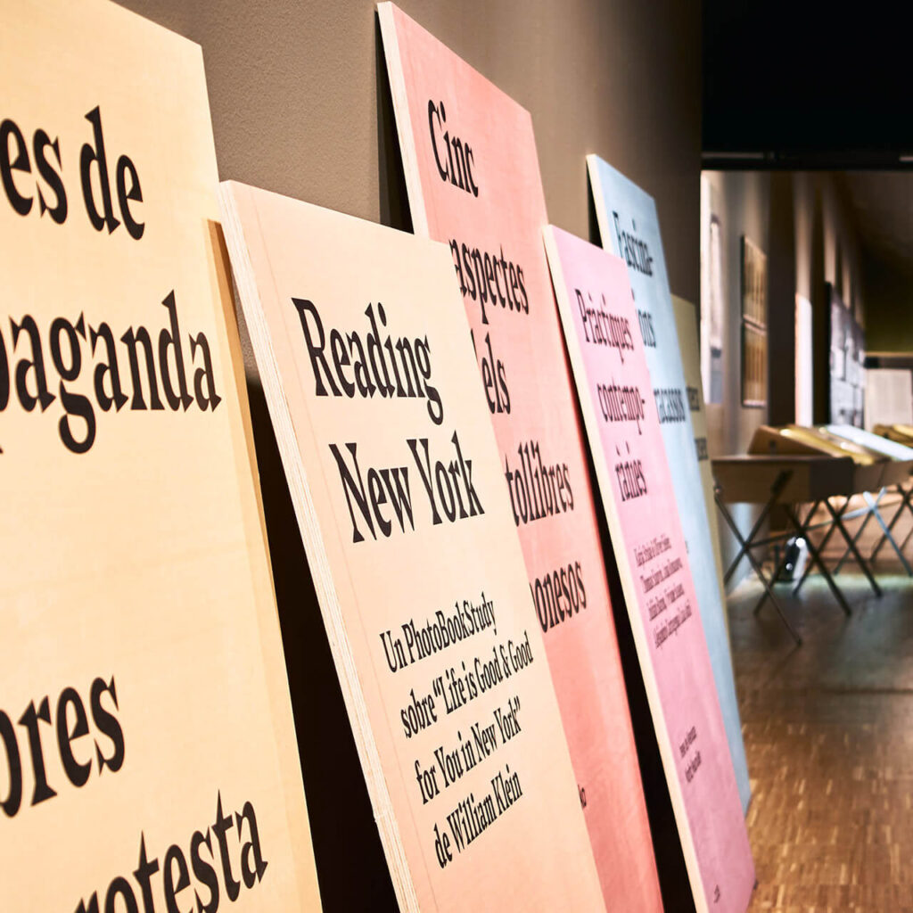
The difficulty when it came to developing the project was to create a visual framework that would be strongly identifiable with the institution and at the same time allow each activity to be expressed based on their characteristics and communicative resources. To this end, the brand was refined with a typographic update, seeking a new font that was consistent with the original image yet containing more friendly forms. An adjustment that also accompanies an expansion of the corporate color palette and a whole series of new standardized resources to create a toolbox with which the design team can work in a versatile and consistent manner.
Through the construction of a new graphic code, thus allowing for the development of all the materials and the definition of a series of basic rules of space construction, we wished to create a multiple system in terms of possibilities yet at the same time simple to apply, being pragmatic for the recipient. By means of a geometry of space in four strips (in reference to the four stripes of the Catalan flag), the new expanded color palette, new typographic resources and a definition of the “look & feel” recommended for photographic and illustration materials, we sought to reorder the entire identity without changing the essence of the logo, which had already been established but was not being used with sufficient forcefullness, strength and above all, presence.
Web » llull.cat


