

Ajuntament de Barcelona
Visual system design for Barcelona City Council’s public housing campaigns
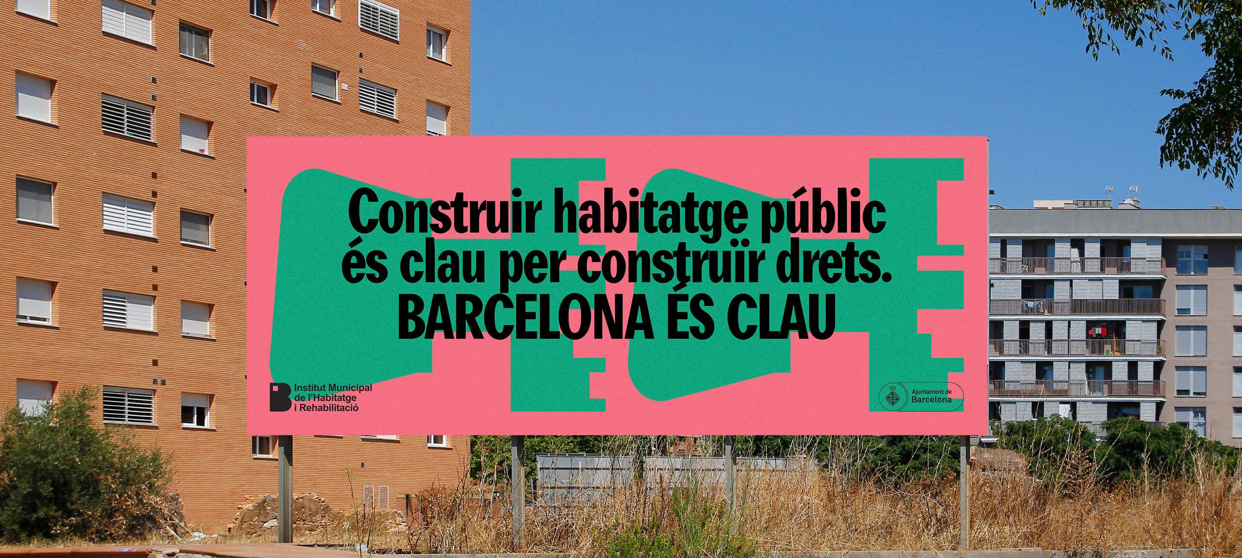
Barcelona City Council asked us to develop a global concept, a graphic code and an identifiable visual system that would help to unify under the same umbrella all the communication actions for the promotion of public housing in the city, ranging from the communication of new projects to open doors days and the evolution of the works.
The aim of the project was to create an identifiable and unified environment that would help to communicate in an original way all the policies and actions related to public housing developed by the council. This required the creation of an “umbrella” communication concept and a strong and flexible visual graphic code, which could be declined in the future variety of media.
The project required the construction of a visual system that would allow the development of a wide variety of pieces, actions and environments that would be easily identifiable by the people who live in the city. From billboards to actions for instagram or tiktok posts. The aim of the project was to create a lasting system that would frame municipal public housing policies.
To develop the campaign we created the claim “Barcelona és clau”, a polysemic play on the word “clau” in Catalan, based on the fact that it can be understood as the element that gives you access to a home and being “key” on something, both the same word in Catalan.
For the development of the code and due to the wide variety of pieces and supports that have to be developed and the posibility that the system can grow, evolve and mutate through time, a flexible environment is built where the word and the messages take on special relevance, occupying practically all the supports. To complement this, more than 15 different key models were designed to give character to all the communication actions, incorporating a series of tools which, combined, make it possible to work with photographs of “inhabited houses”, illustrations, messages adapted to each piece, images of keys, etc
In order to systematise the graphic code, the structure of the message and the graphic and visual system, an extensive application guide is drawn up. It “systematises” the construction of the pieces without creating rigid frameworks or rules that limit the creativity of the future teams that will have to work with it, being able to evolve and make the system grow, as this framework must be able to last over time. The guide aims to build a flexible environment that allows to draw a line and an articulated code through a common axis, leaving creative margin in the execution of each piece.
Conclusion
A new creative campaign framework has been created, a creative and graphic performance environment that seeks timelessness while allowing creativity to grow in each piece thanks to a varied “toolbox” that incorporates from a basic campaign concept to a varied, flexible and adaptable graphic code.


