


Honko / Hospital Vall d’Hebron
Naming, visual language and experience design for the new inpatient oncology and haematology ward at Vall d’Hebron
Ten years after the Parc d’Atencions —the paediatric oncology and haematology day hospital we designed for Fundació Small—, the new inpatient onchaematology ward at Hospital Universitari Vall d’Hebron (Barcelona) opens its doors, driven by Fundació Small, Fundació Albert Bosch and Fundación Aladina, a project we have been developing together with Plasencia Arquitectura since 2021.
While the Parc d’Atencions serves patients who receive their treatments on a day-hospital basis, Honko accompanies the most severe cases requiring hospitalisation: children and young people who live there for weeks or months, alongside their families and supported by the medical team. The brief —to humanise the space, improve the experience of everyone living within it and facilitate circulation— was clear, but the challenge ran deeper: to create a pleasant, liveable environment for people in a delicate and vulnerable situation, one with a profound emotional weight.
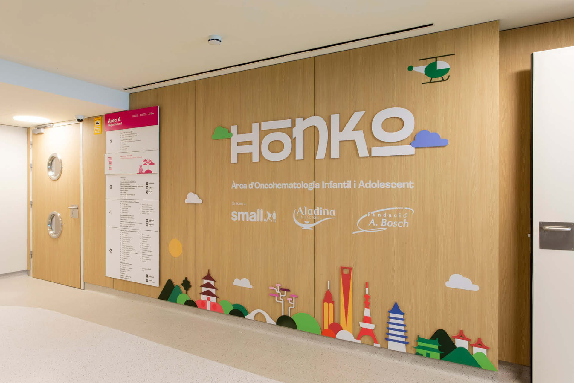
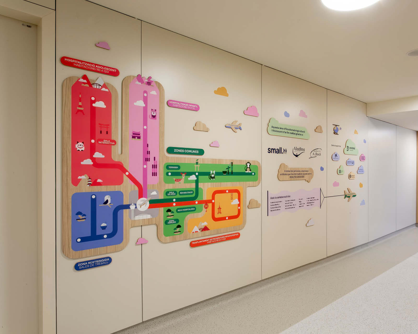
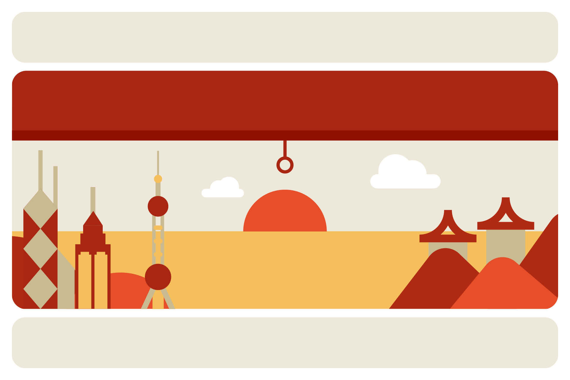
The project begins with the definition of the naming and the creative concept. The hospital’s own style guide assigned a continent to each ward, and we were given East Asia. The name had to title a space, not describe it. The answer was Honko: a fictional city with an Asian ring to it that allows for a warmer, more approachable narrative, while concealing a double reading —Hong Kong as a metaphor for a crossroads of cultures, and ONCO as a shorthand for oncology. A name that functions as a brand, one that can be extended to every corner of the ward, offering a more human and approachable alternative to clinical terminology.
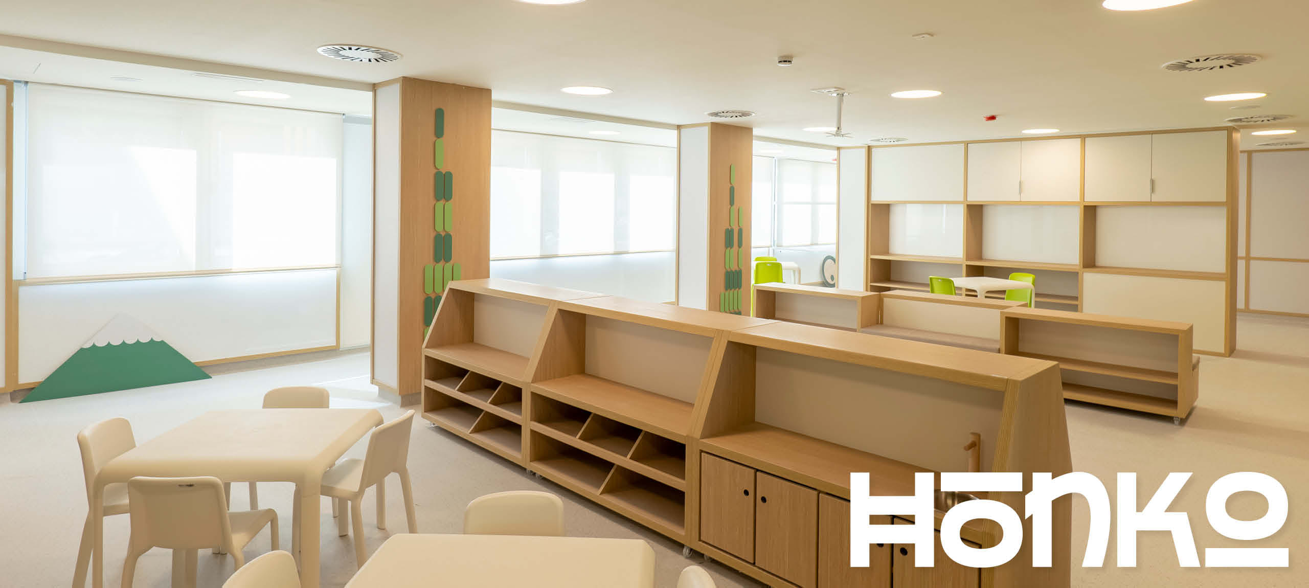
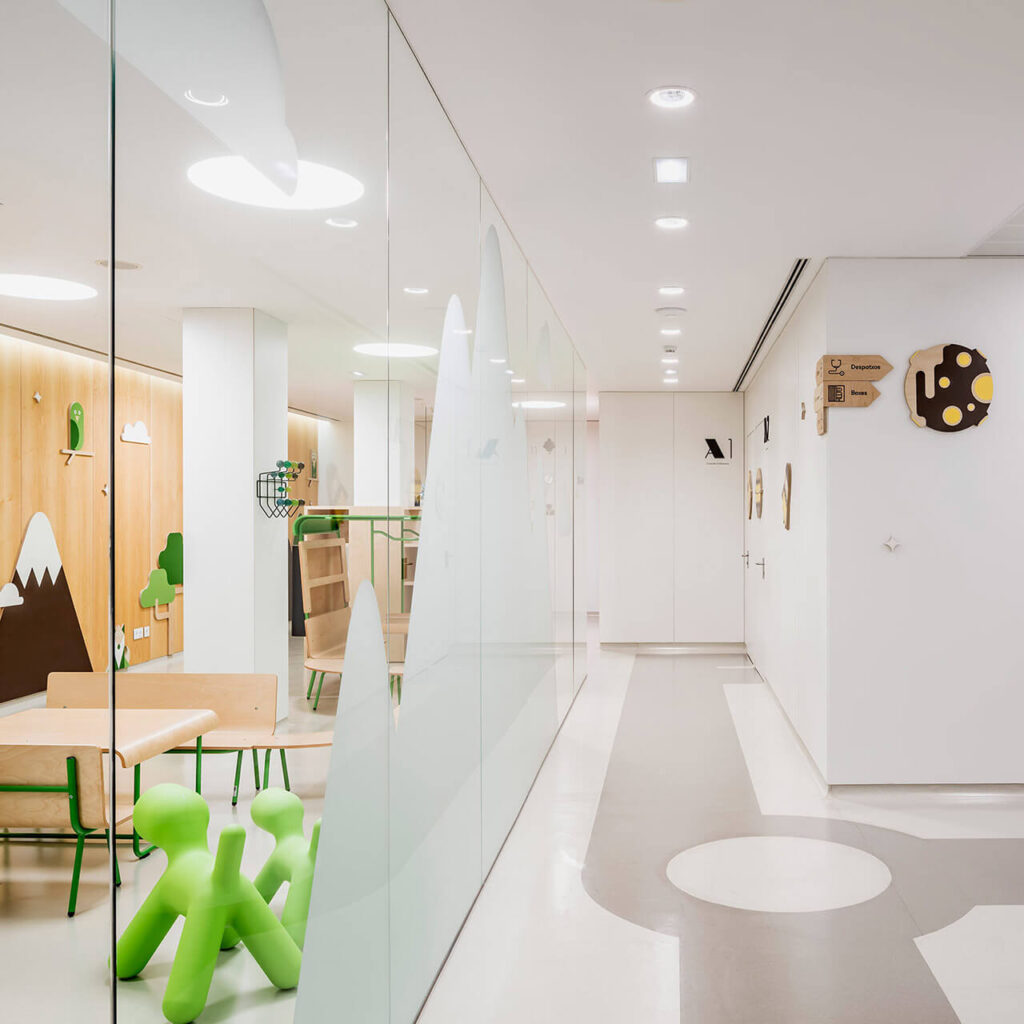
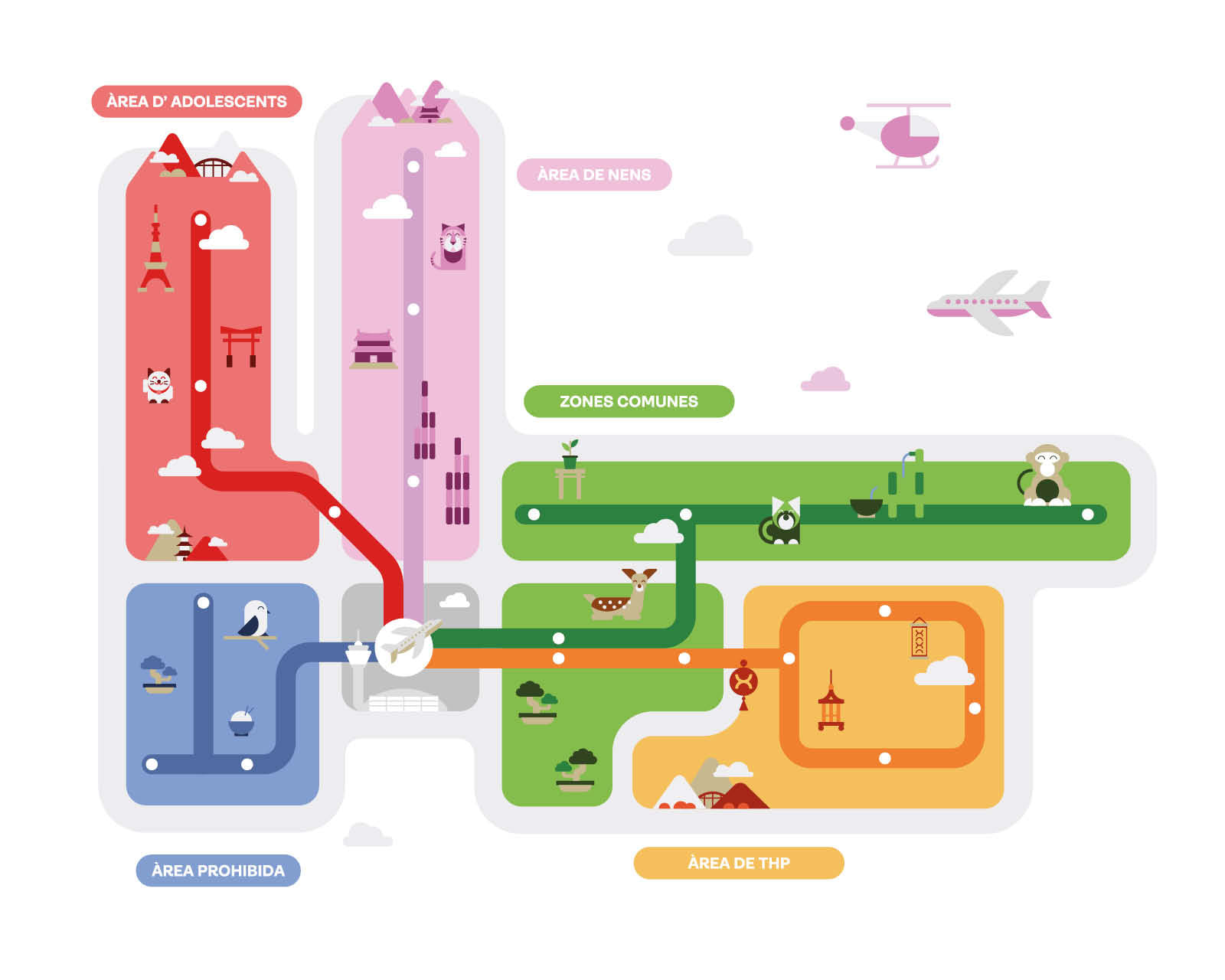
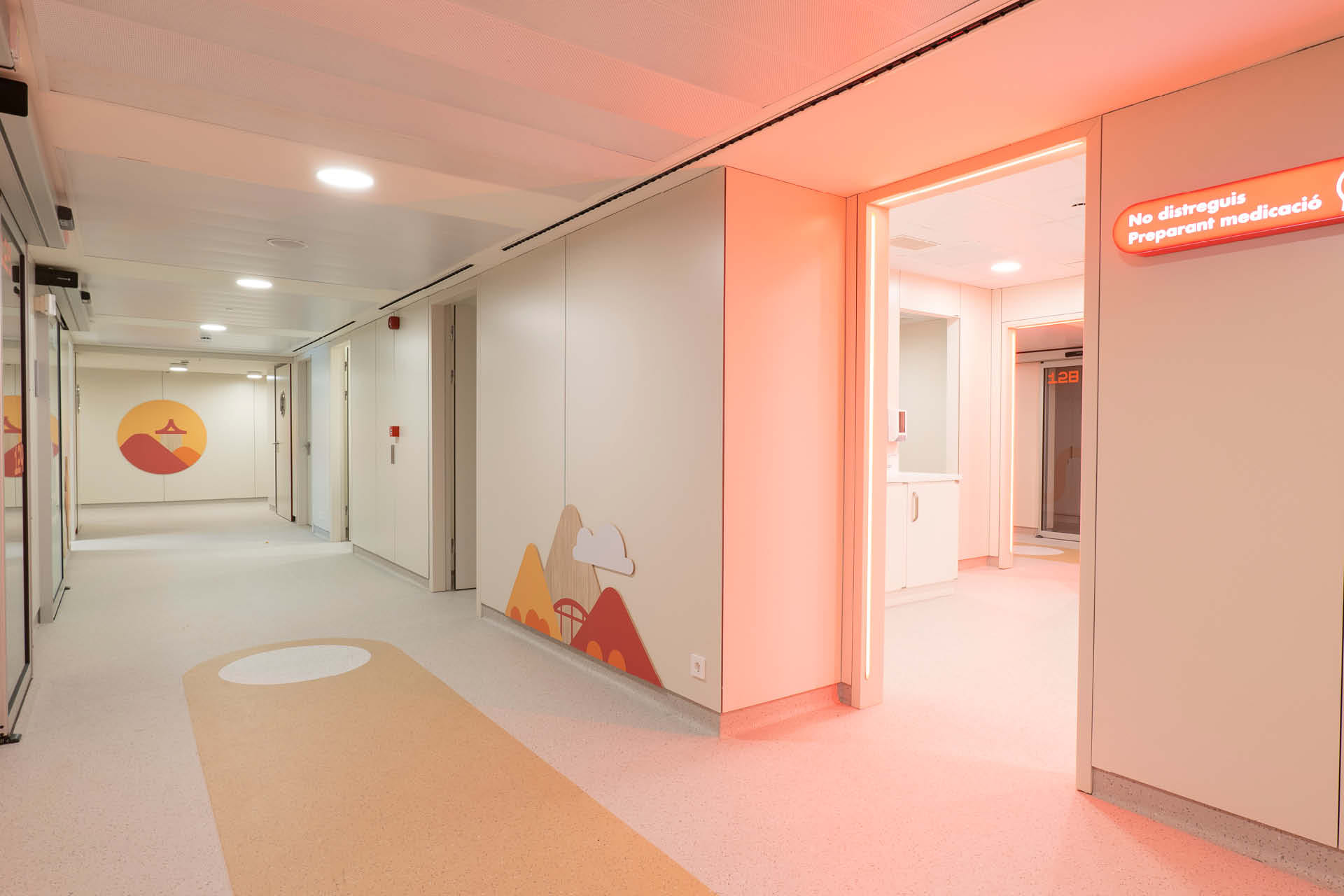
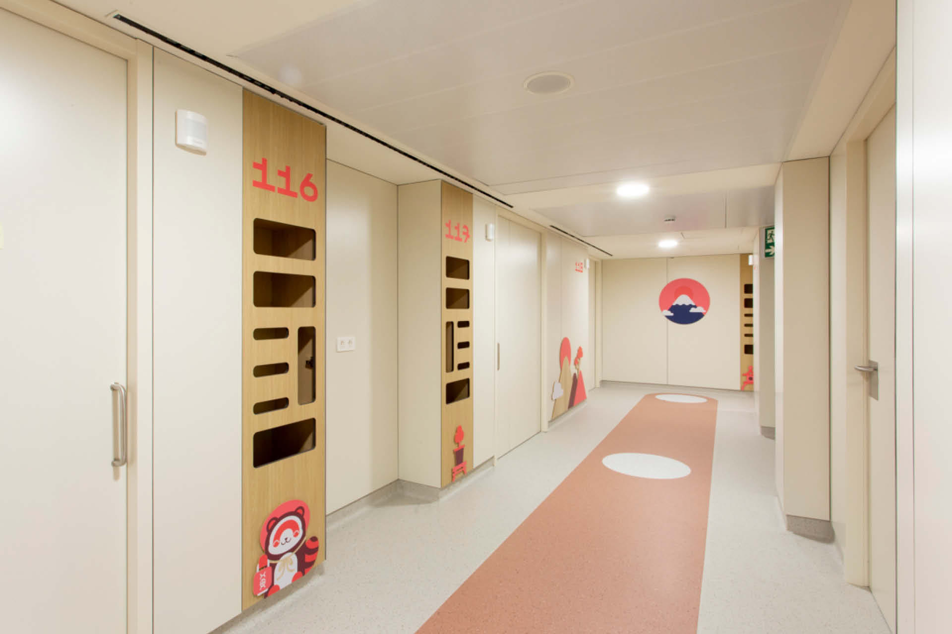
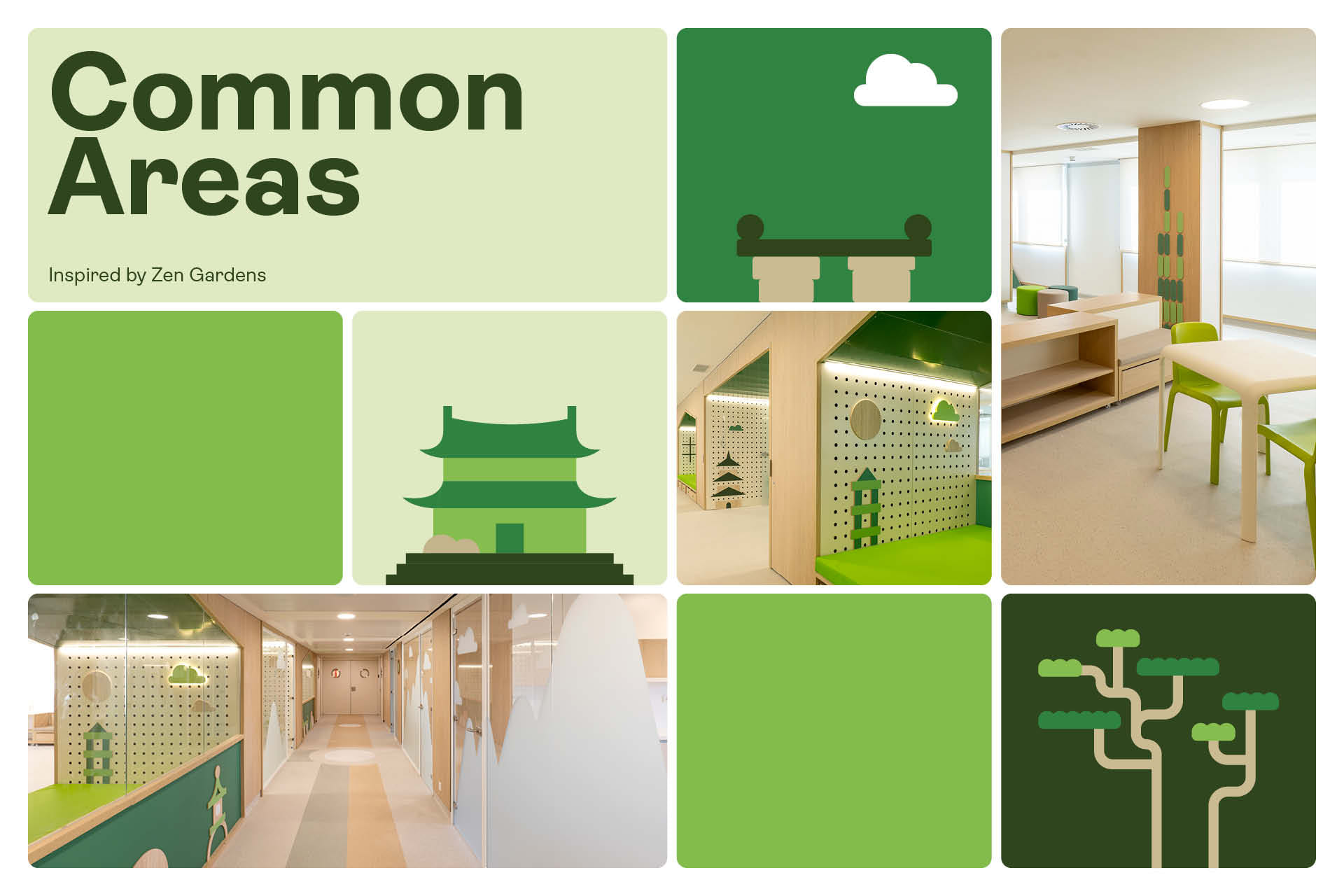
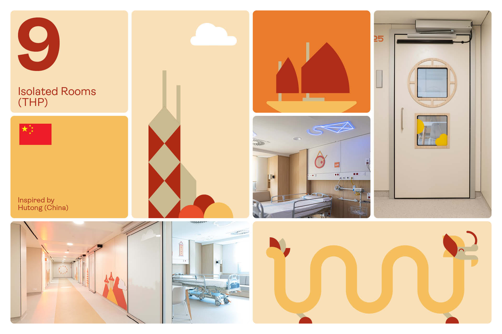
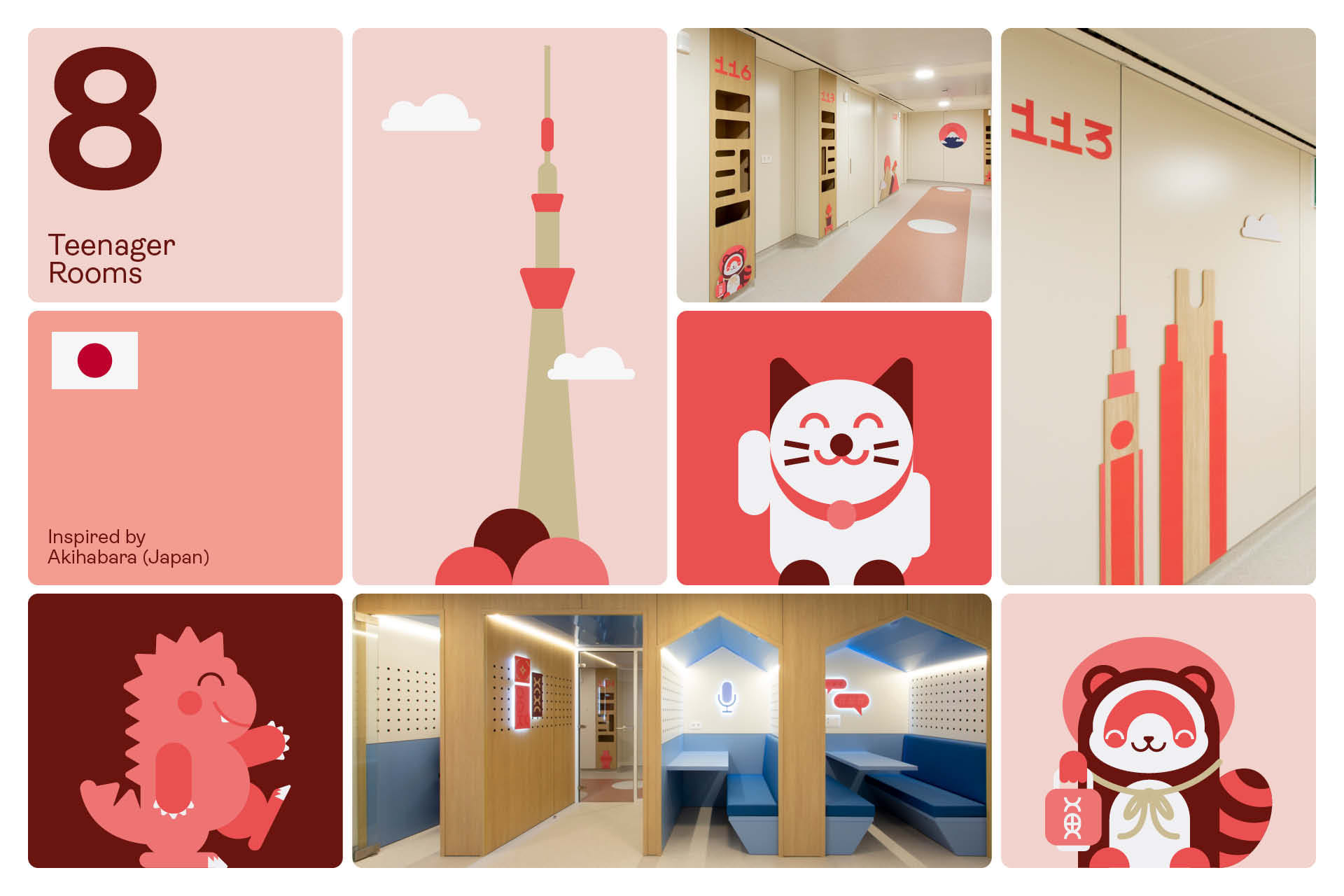
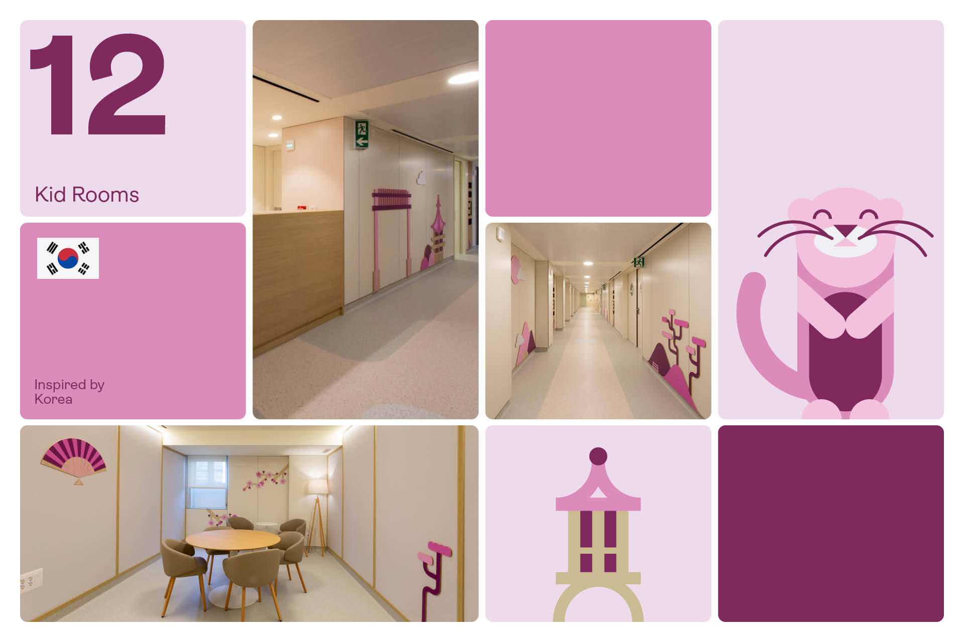
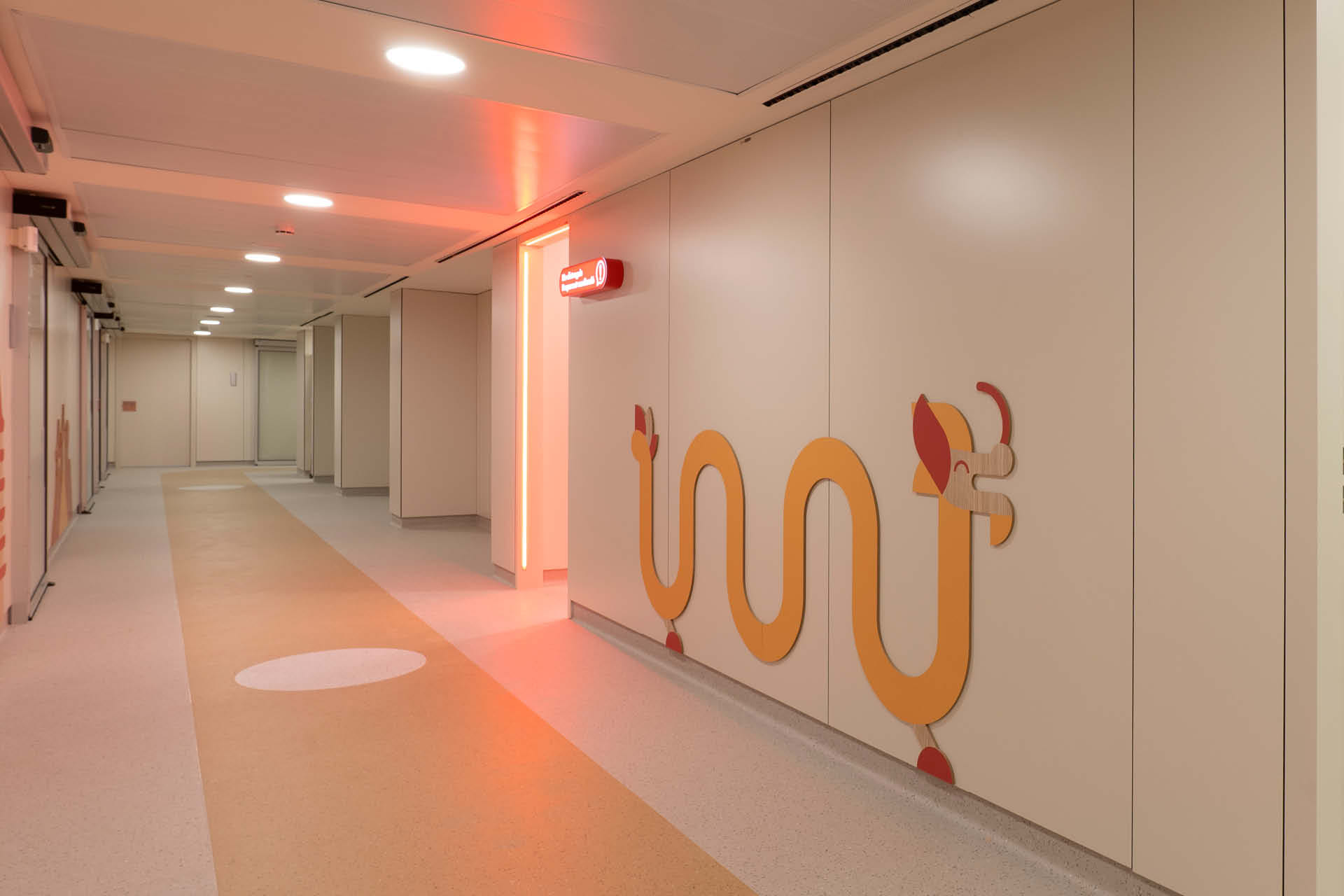
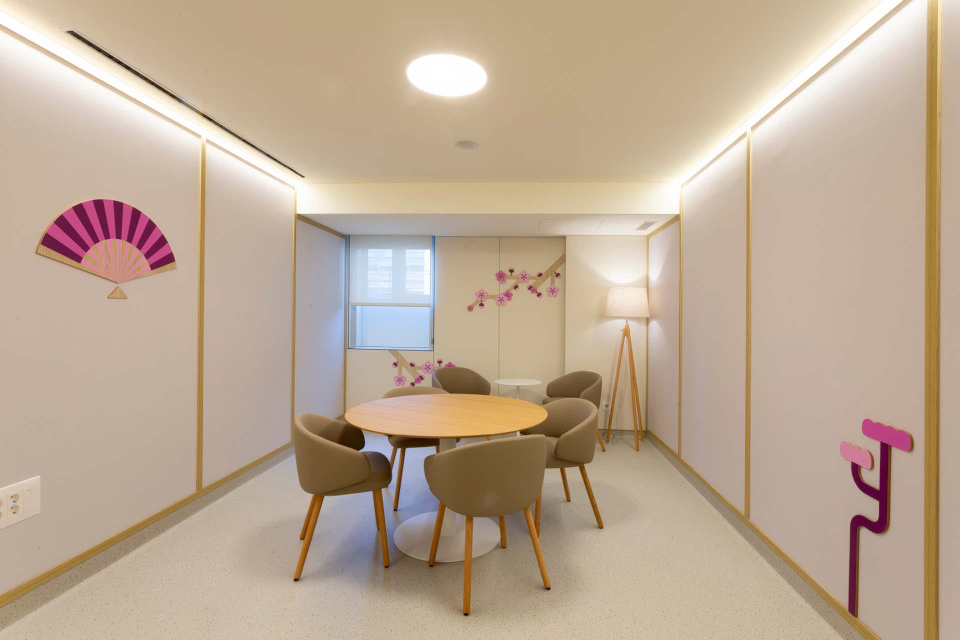
Under the concept of an imaginary city, Honko is divided into five themed neighbourhoods, each with its own cultural atmosphere and assigned to a specific audience and function. Upon entering, the welcome panel takes the form of a decorative metro map that helps visitors orientate themselves across the different environments and neighbourhoods, connected by their colour-coded lines. Five neighbourhoods: China’s Hutongs inspire the THP zone —the isolation rooms for immunocompromised patients—; Korea and its Hanoks, the children’s area; Vietnam and Asian nature, the shared family and children’s spaces and the terrace; Japan’s Ryokans, the adolescent area; and Akihabara —Tokyo’s tech and youth district— the leisure and games zone for young patients. Beyond the five neighbourhoods, a bad news room is also designed: a space conceived for the moments when a patient’s progression points towards a less favourable outcome, a place that stays with those who pass through it, handled with particular care and sensitivity.
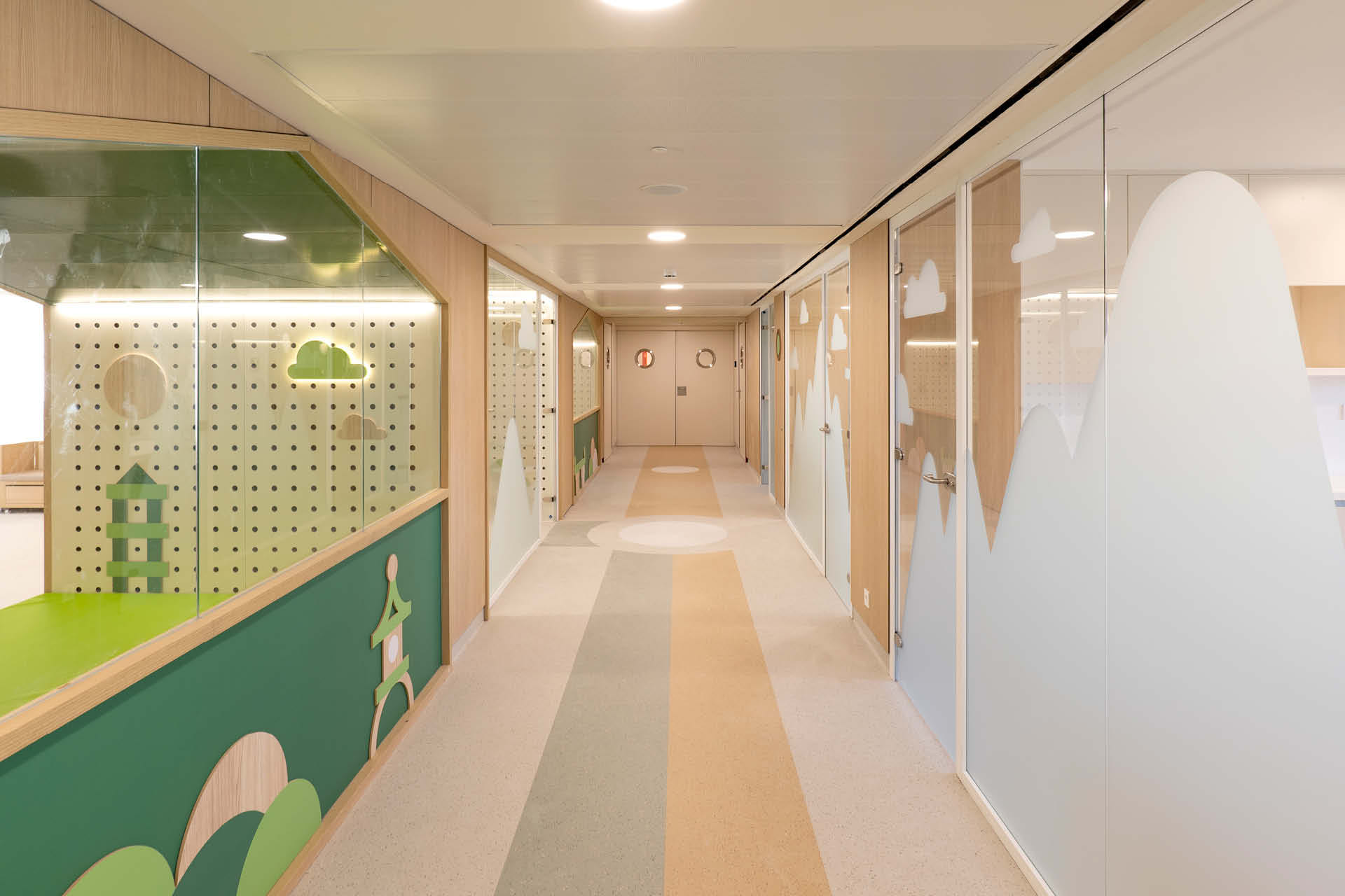
The illustration style continues that of the Parc d’Atencions and adapts to each world, as patients who are hospitalised often move between Honko and the Parc d’Atencions — the visual universe must therefore be coherent, legible and familiar across both, since they form part of the same service. The flooring reinforces the system: designed as metro lines, each colour guides people towards their environment, making circulation itself part of the narrative.
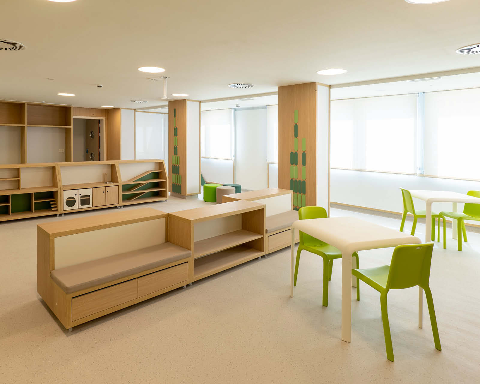
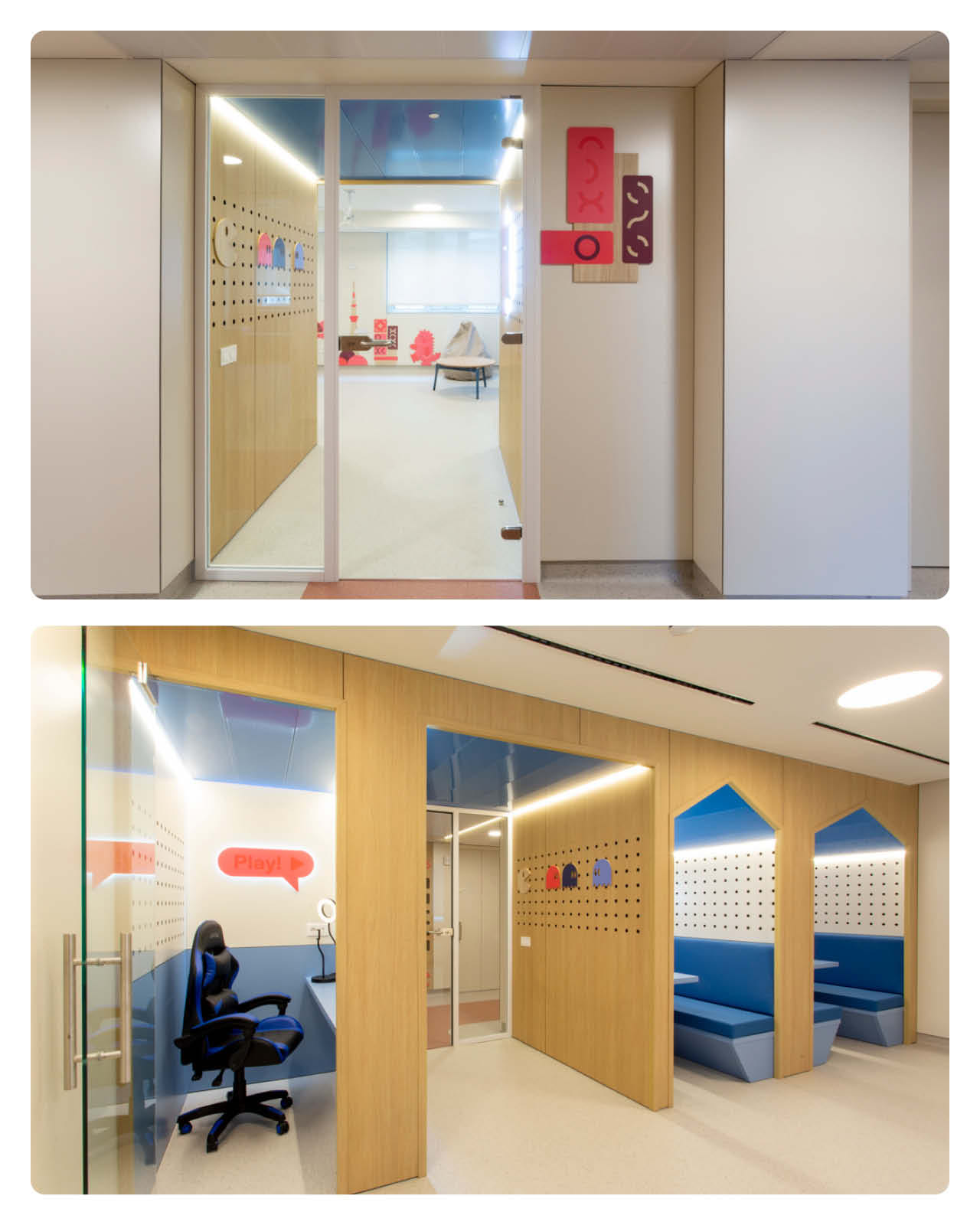
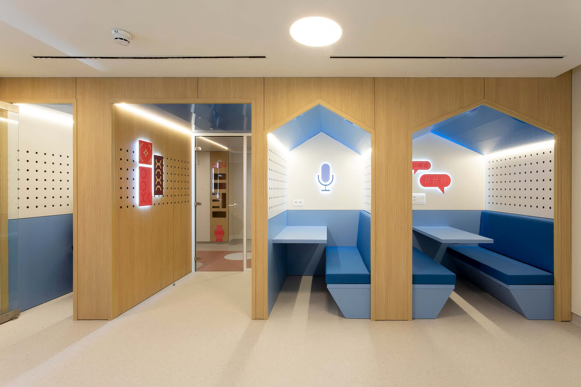
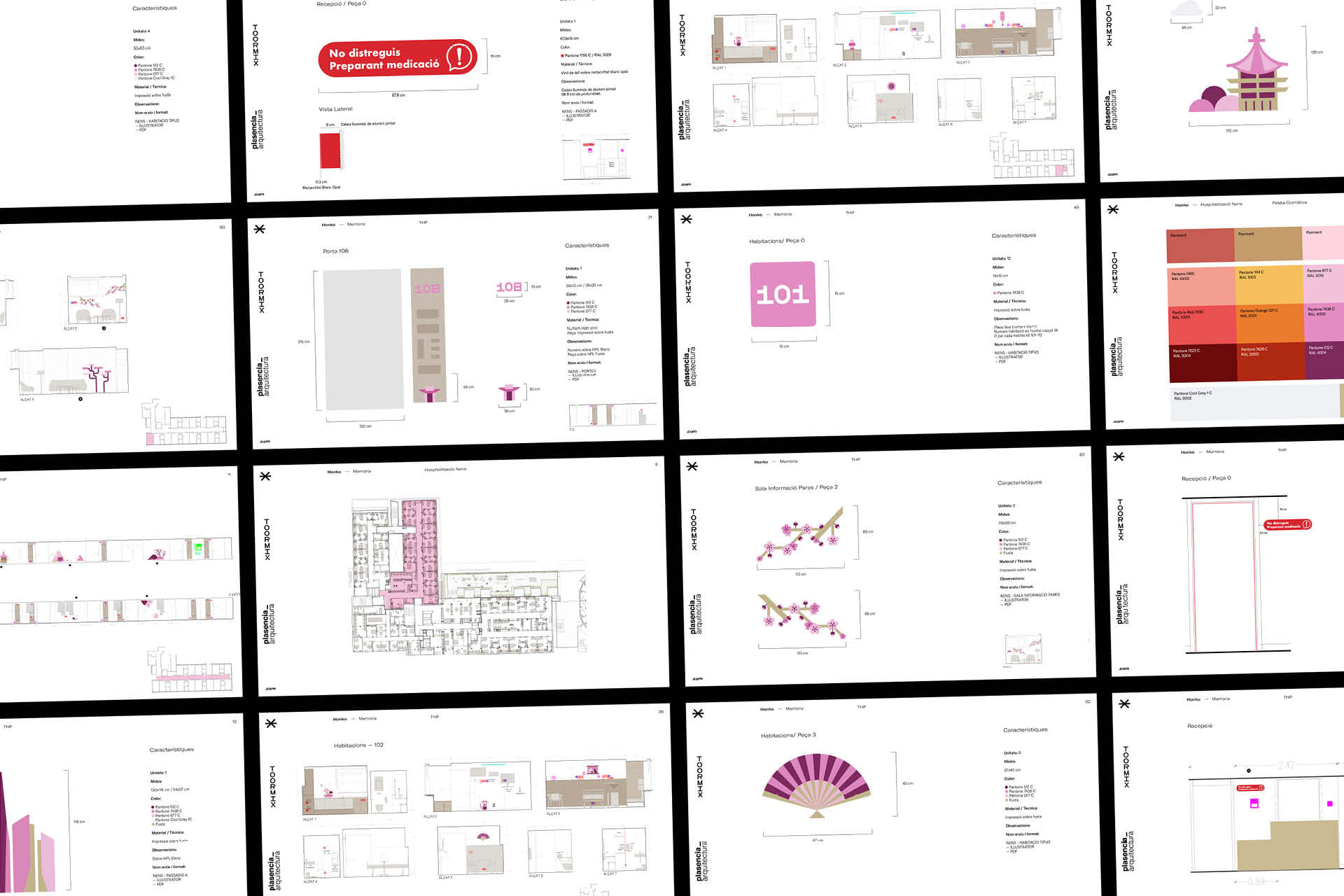
The project demanded thinking across six simultaneous profiles: three patient groups —infants, children and teenagers— and three user groups —family members, friends and the medical team. The medical staff are constantly present, which meant the environment could not be visually overwhelming: the goal was a space that supported the best professional attitude without generating stress or visual fatigue. Each profile has been given its own refuge: private spaces for teenagers who need independence and intimacy, sensory pods for infants, a games console room and podcast space, a gym, and decompression zones for families. All rooms are individual, conceived as small, personalised apartments: coloured lighting with forms adapted to each environment, always with natural light, warm wood finishes and indirect lighting. The doors to THP rooms feature two windows at different heights —one for adults, one for the younger patients’ friends— so that connection is never entirely severed. The signage, produced by Signular, uses wood and bioprotected materials that are easy to sanitise and designed to meet all safety and infection control standards.
Architecture: Plasencia arquitectura
Signage production: Signular