
Barrufet Seafood
Naming, identity and web for a seafood distributor
Barrufet Congelados, a family-owned company specialising in the sale and distribution of fish and seafood with over sixty years of history, approached us with a challenge that went far beyond design: their name was holding them back for two reasons. On the one hand, they do not only trade in frozen products —they also work with fresh and semi-preserved fish— and the existing name created confusion and closed doors to new markets. On the other, it was shared with another company in the sector with which they have no connection, one that was quietly eroding a reputation built over decades of dedication and care for the product.
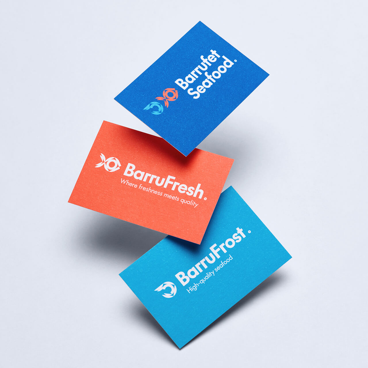
The project began with a brand strategy consultancy and a full review of the naming architecture. The naming proposal addressed both problems at once: Barrufet Seafood as the umbrella brand —where seafood encompasses everything that comes from the sea, with no restrictions on format or product type— and two divisions with their own identity and narrative: BarruFresh for fresh produce and BarruFrost for frozen. Each division operates with commercial autonomy while sharing the brand equity, reputation and standards of excellence of the house. A coherent, scalable system built for international growth.
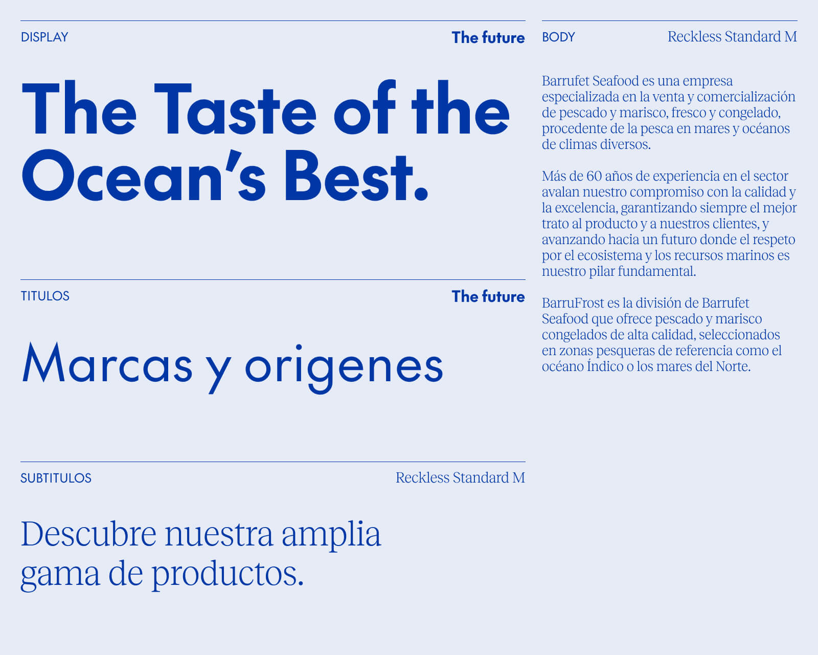
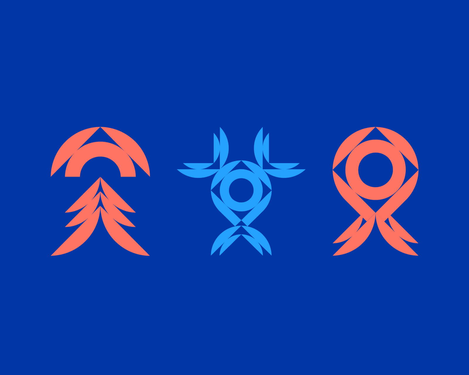
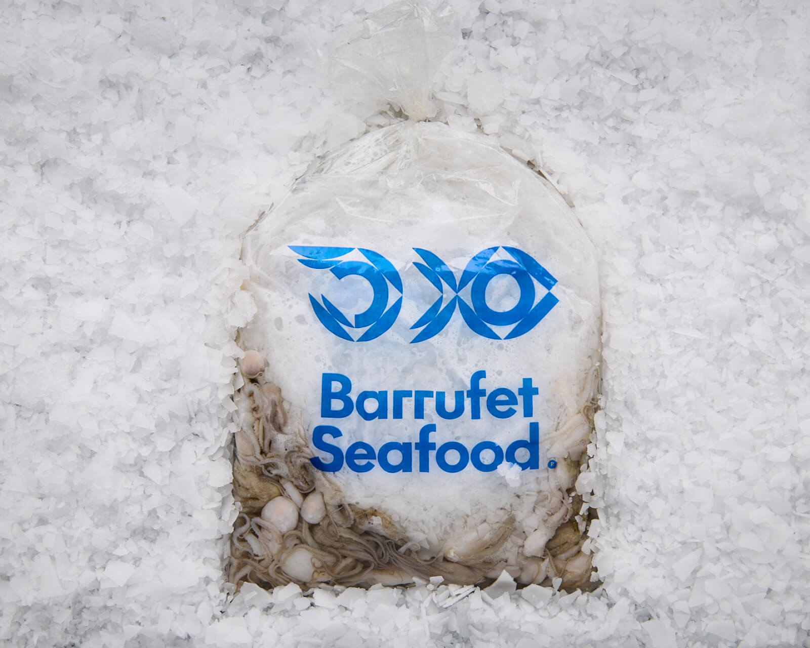
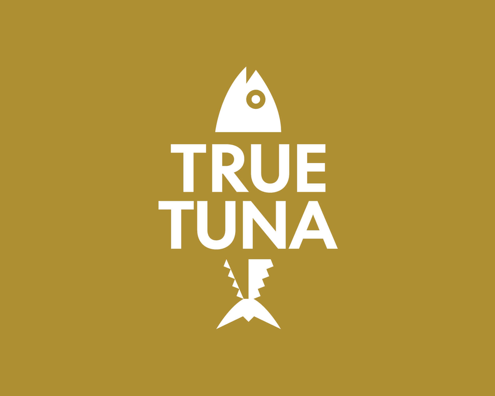
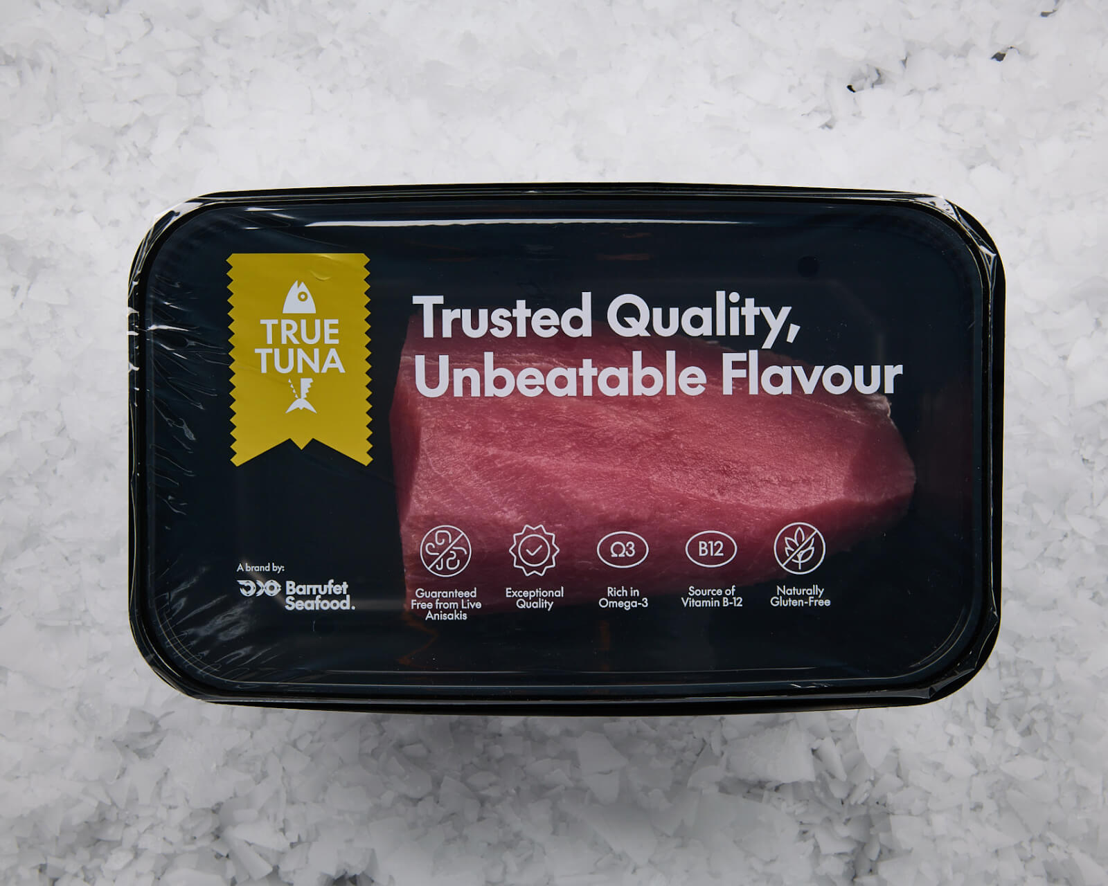
The visual identity takes a modular geometric approach that allows the main brand to be adapted across each division without losing unity. The deep blue of the original brand is retained and reinforced as the corporate colour of Barrufet Seafood; a cooler blue strengthens BarruFrost, while a salmon orange identifies BarruFresh. Each division also incorporates its own product brands —Ísfish, Dong Hai, Linda Grey, Essential and True Tuna—, the last of these the only entirely new creation, born alongside the project and integrated seamlessly into the visual ecosystem.
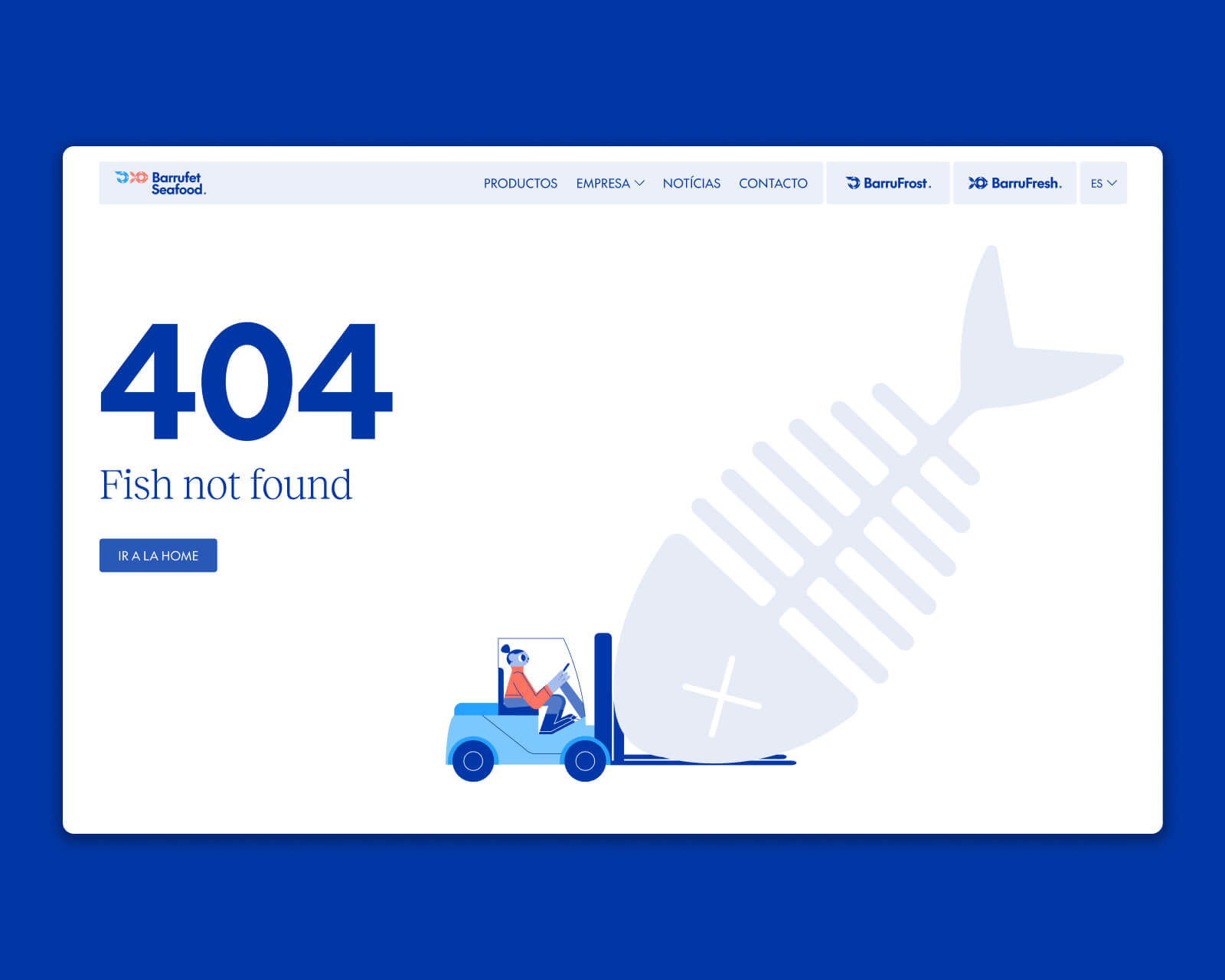
The website is conceived as a multi-brand platform covering three brands and three different ways of approaching the company: through the updated flagship brand (Barrufet Seafood) or through the individual product-line divisions (BarruFresh and BarruFrost). To support both narrative clarity and usability, the site is built under the Barrufet Seafood architecture, with dedicated landing pages for each division, each with its own independent domain. Fresh and frozen customers do not always overlap —a BarruFresh buyer is not necessarily a BarruFrost client— but the structure ensures that at every point of contact the relationship between divisions is visible and generates cross-brand quality assurance. Each landing page invites visitors to discover the other. Navigation is independent; trust is shared.
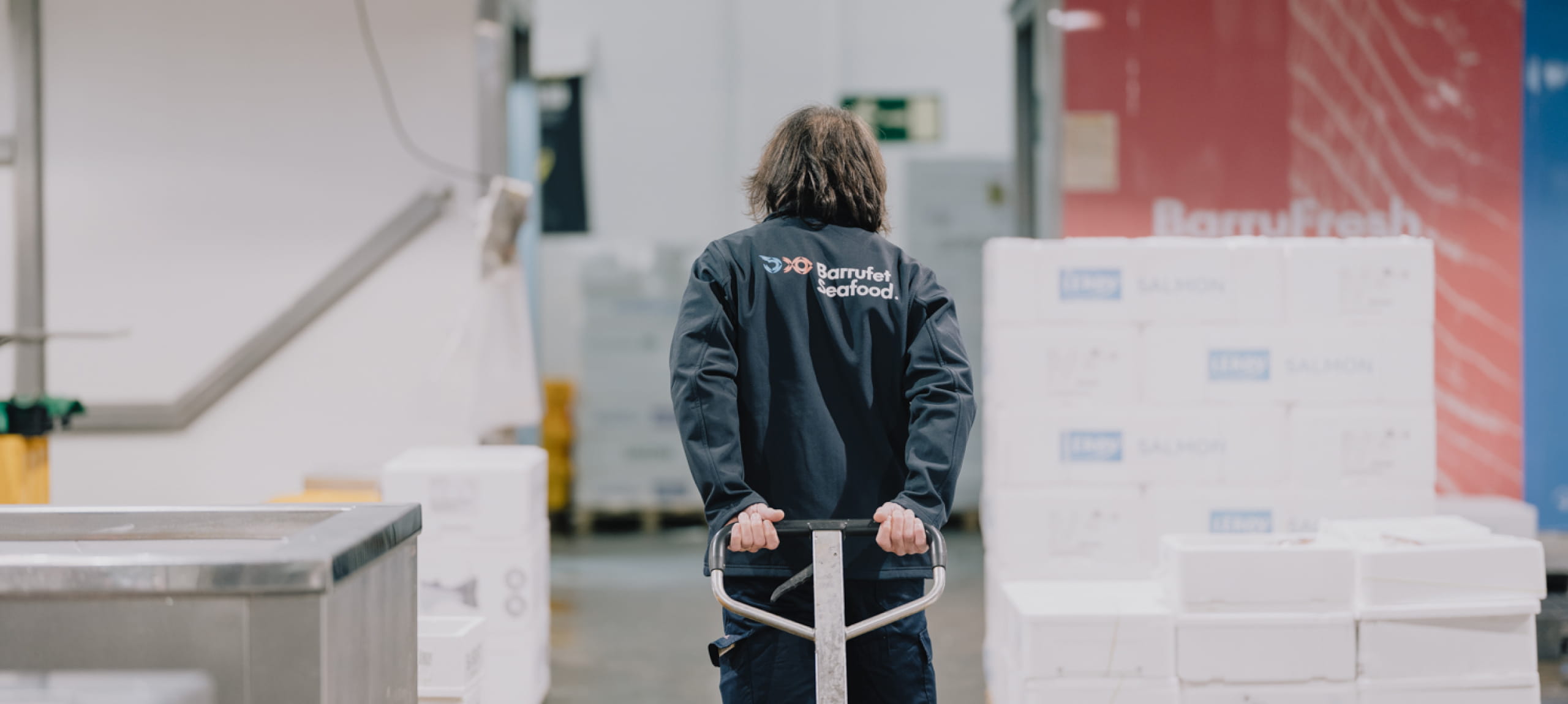
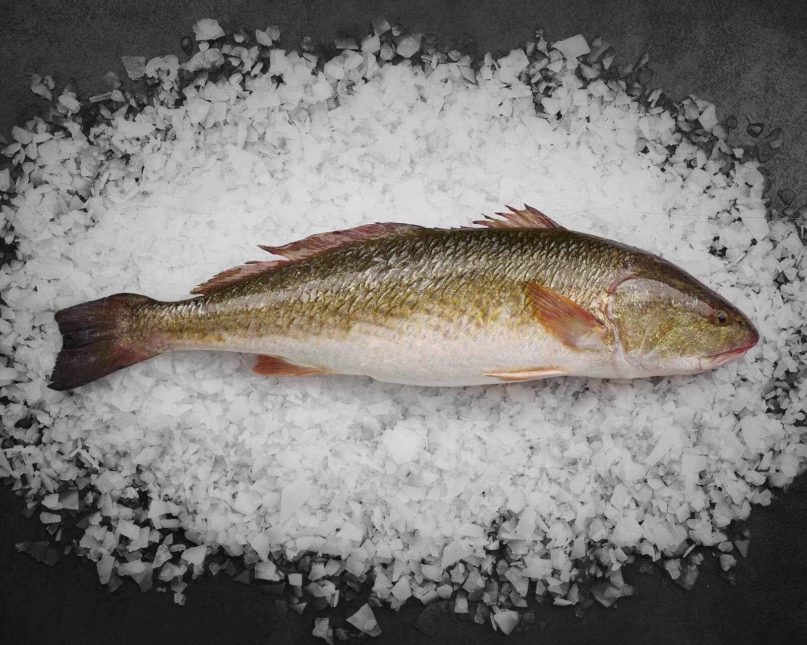
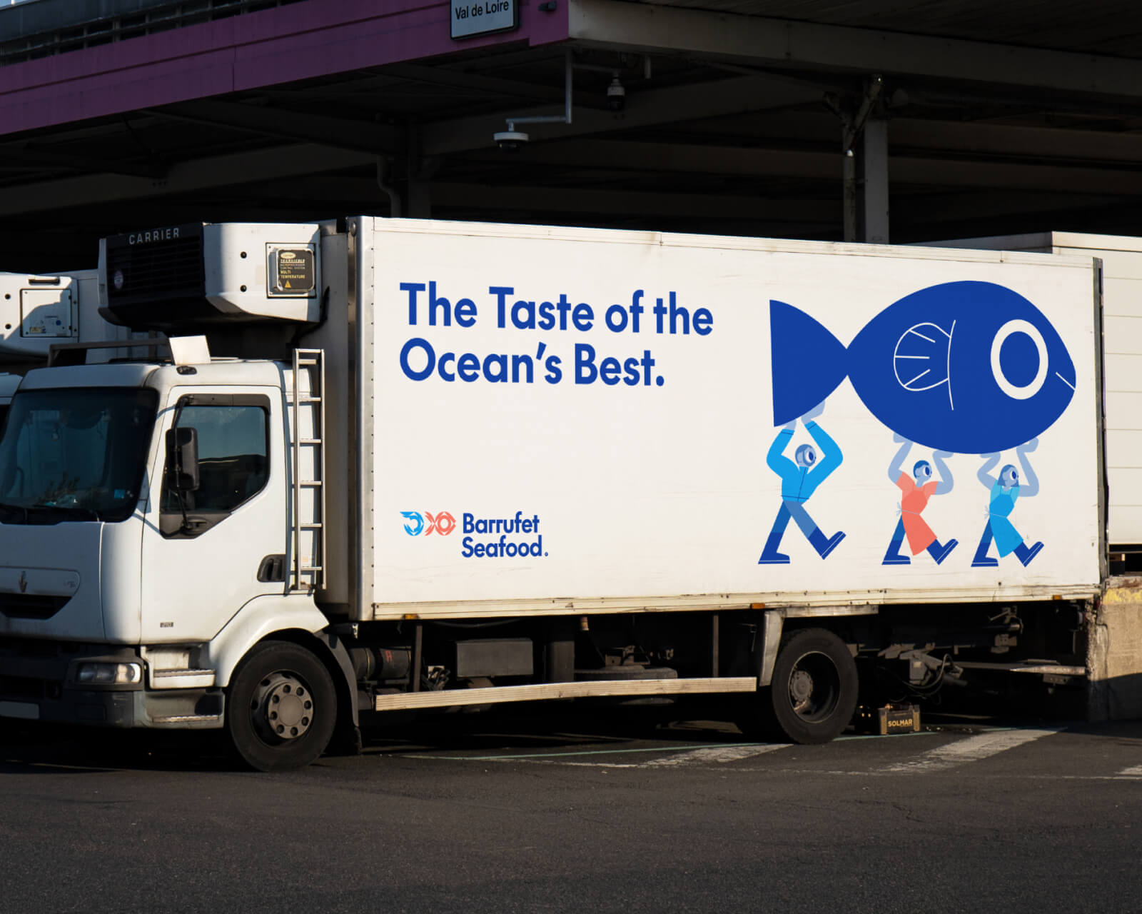
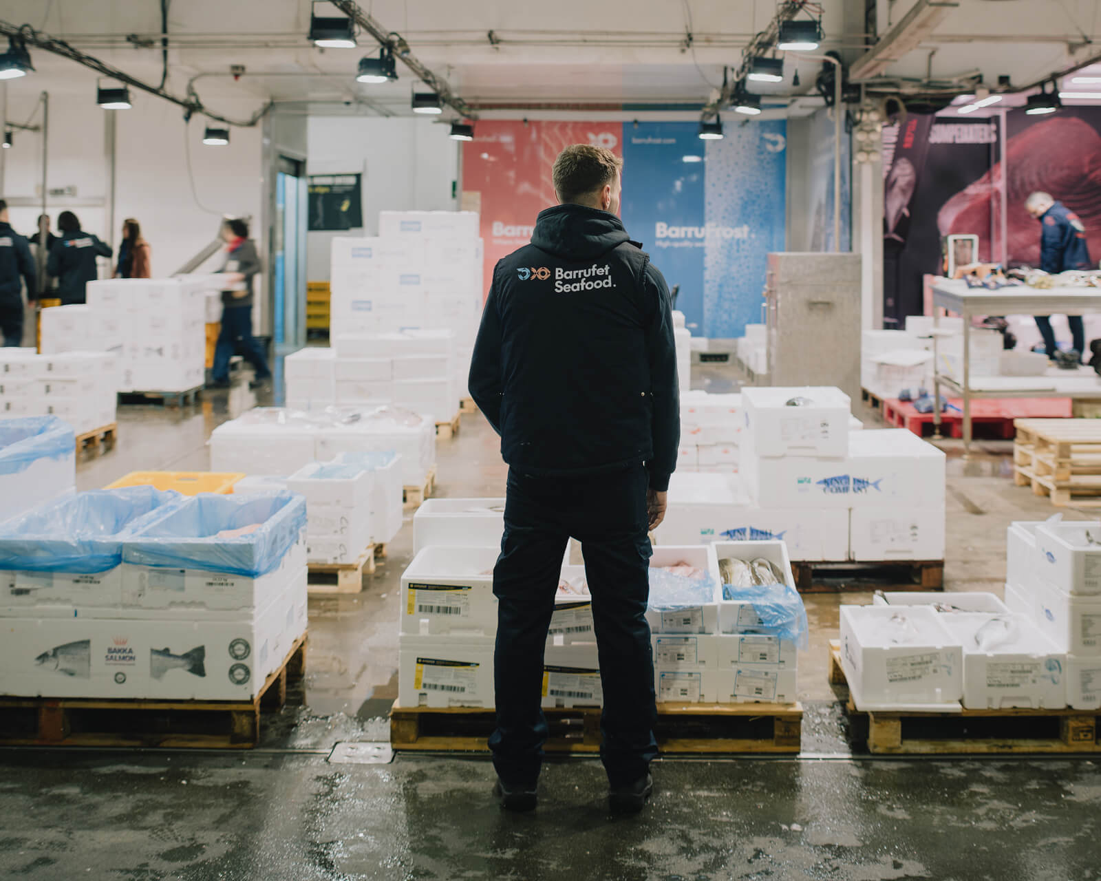
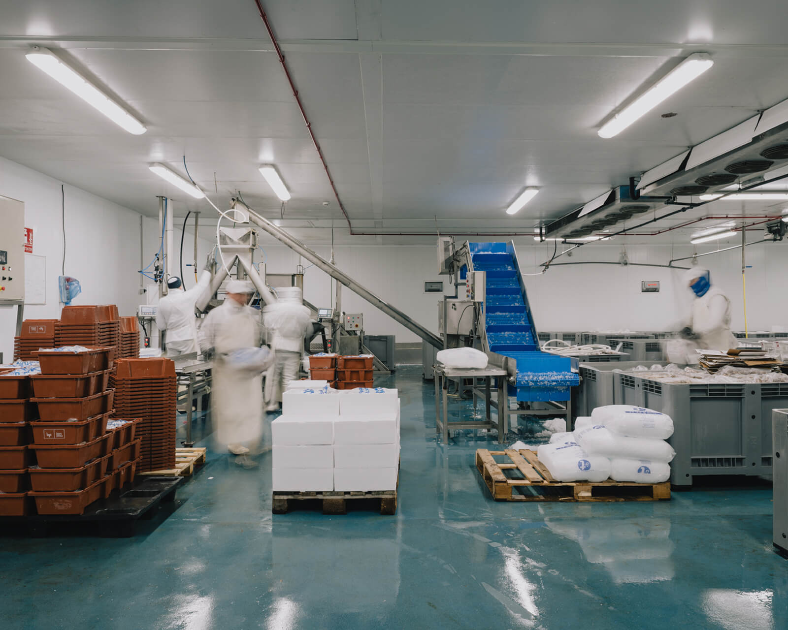
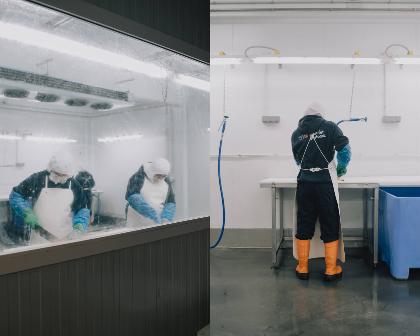
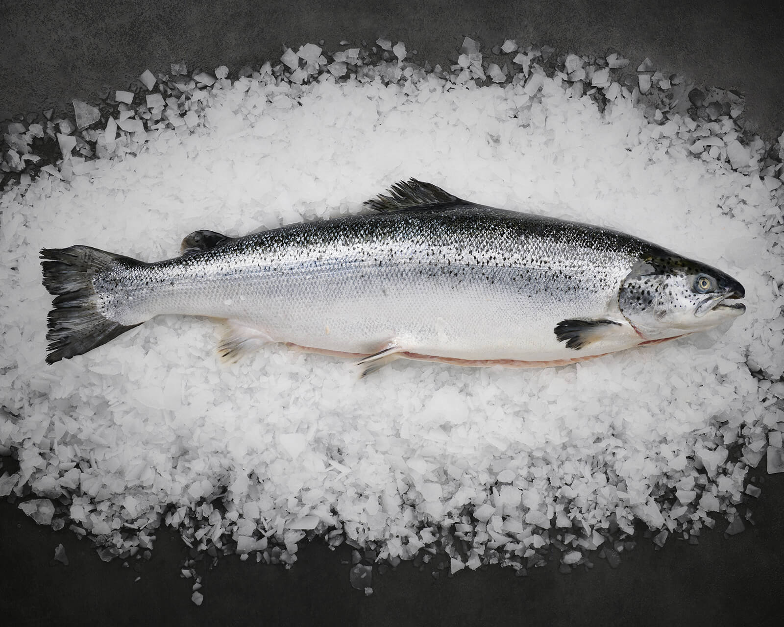
The art direction of the product and process photography completes the brand story: clean, contemporary images showing the Mercabarna facilities, the processing rooms and the people behind every order. A company with sixty years in the sector that, for the first time, has an image worthy of what it truly is.